eCommerce Popups Guide (2025): Types, Examples, and How to Create in WordPress
If you’ve ever shopped online, you’ve probably come across a popup. Many eCommerce stores use popups to grow their email list, increase their conversion rate, and reduce cart abandonment.
But here’s the thing—popups only work when they’re done with care. Timing, design, and message all matter for a reasonable conversion rate.
In this guide, we’ll look at what ecommerce popups are, how they work, and how you can use them without hurting the shopping experience.
You’ll also see real examples, best practices, and a simple way to set them up on your WordPress site using Poptics.
Let’s start with the basics.
Table of Contents
What is an eCommerce popup?
An eCommerce popup is a message or offer that appears on your website while someone is browsing. It could appear in the center of the screen, slide in from the side, or drop down from the top.
You’ve probably seen popups like:
- “Get 10% off your first order.”
- “Wait! Don’t leave—here’s a deal.”
- “Subscribe to get free shipping.”
Popups can serve all kinds of purposes. Some popups ask for email addresses with a clear sign-up form, while others offer a discount code in exchange for joining a list. The key is that they’re meant to catch a visitor’s attention without pulling them away from what they’re doing.
While they may look simple on the surface, the most effective popups are built with intent. When used right, they can improve your conversion funnel and guide visitors based on their customer awareness stages from curious to ready to buy.
Main types of eCommerce popups (with use cases)
Popups come in all shapes and sizes, but they usually fall into a few main categories. Each type has its own purpose, depending on what you’re trying to do.
Let’s go over the most common types of ecommerce popups,
1. Email signup popups or welcome popups
A welcome popup or email popups is a small message that appears shortly after a new visitor lands on your website. These are often tied to a lead magnet like a first-order discount or free shipping, in exchange for their email or phone number. It’s a tried-and-true marketing tactic to capture email addresses and build an effective email marketing strategy.
Example: A new visitor lands on your homepage. After a few seconds, a popup offers: “Get 10% off your first order when you subscribe.”
2. Exit-intent popups
An exit intent popup is a type of exit popup that appears when a visitor moves their cursor to close the tab. Its goal is to grab their attention one last time by offering a discount, freebie, or a reminder to make sure to stay.
Example: “Leaving so soon? Don’t forget to claim your free shipping, still available at checkout.”
3. Scroll-triggered popups
A scroll-based popup appears after someone scrolls a certain distance down your page. It targets users who are already engaged and reading your content. You can use it to show relevant offers or messages based on their interest, like product suggestions, lead magnets, or discount codes.
Example: “New here? Take 10% off your first order.”
4. Cart abandonment popups
A cart abandonment popup shows up when someone adds items to their cart but doesn’t check out. It gives them a quick reminder to finish their order and re-engage abandoned carts and cart abandoners, sometimes with a small offer or just showing what they left behind.
Example: “You left something in your cart. Complete your order now and get free shipping.”
5. Discount or flash sale popups
A sale announcement or flash sale popup shows up to let visitors know about a special deal or discount. These often include a discount code, a countdown timer, or limited-time sales promotions to push faster action.
These often include a discount code or limited-time sales promotions to push faster action.
Example: “Today only—20% off all shoes. Sale ends in 02:59:11.”
6. Product recommendation popups
A product recommendation popup appears based on what a visitor is viewing or has added to their cart. With the help of AI product recommendations or recommendation engines, it suggests related or matching items to increase the chances of a bigger order, as well as improve your average order value.
Example: A customer views a t-shirt. A popup suggests: “You might also like these jeans.”
7. Post-purchase popups
A post-purchase popup appears after someone completes a checkout. It encourages actions like leaving a review, sharing a referral, or buying an add-on product. You can use these to invite SMS subscribers or show Email templates for referrals with your ongoing email marketing flow.
Example: “Thanks for your order! Share your referral link to get 10% off your next purchase.”
This type of popup supports a smoother customer experience by matching the message to the user’s intent.
🌟 Read also: Most Effective Email Templates for Restaurant Marketing
How to create an eCommerce popup in WordPress using Poptics (step-by-step)
If you’re running a WordPress store and want to show a popup, whether it’s for a welcome offer, a product reminder, or a seasonal deal, Poptics makes the setup pretty straightforward.
Poptics is a lightweight popup builder explicitly built for WordPress users. It gives you a visual editor, pre-built templates, and control over where and when your popups show up.
Want to see how it works in a real campaign? Check out how Poptics uses popups in different use cases.
Here’s a step-by-step look at how to create an eCommerce popup using Poptics.
Step 1: Install and activate Poptics
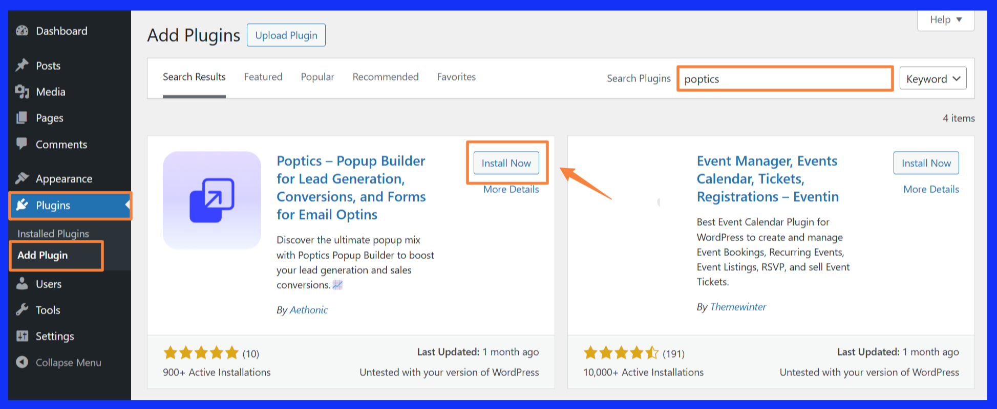
The first thing we need to do is to download and install the Poptics on your WordPress dashboard. Simply follow the steps below:
- From your WordPress dashboard, go to Plugins > Add New.
- In the search bar, type “Poptics” and then click” Install Now”.
- Once installed, click Activate.
That’s it! You’re ready to start building your first popup.
Step 2: Create a new popup
On the dashboard, you’ll see an option to create Popups Campaign. You can either:
- Start with a ready-made template, or
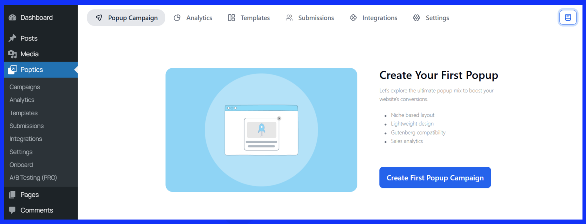
- Build your own from scratch
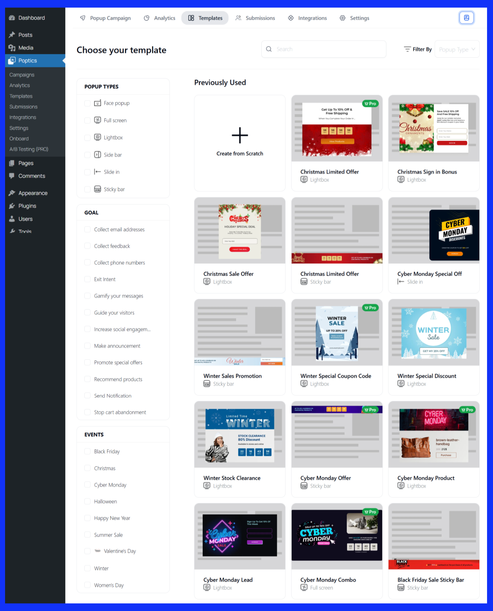
Both options take you into the popup builder, where you can customize design, content, and behavior. Let’s get to know each process one by one.
Create a campaign from scratch
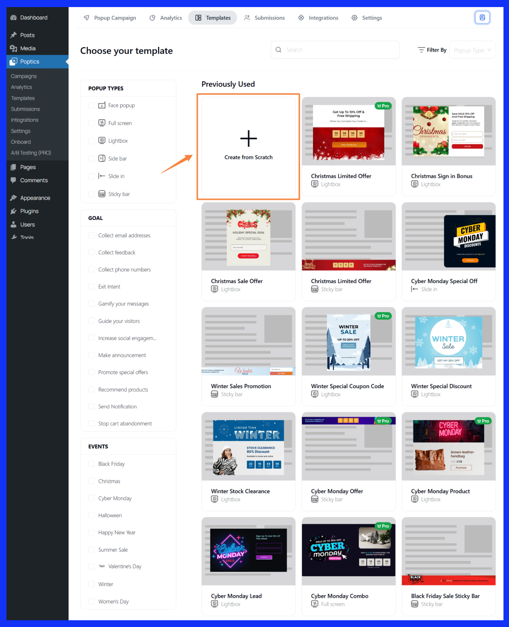
- First, click on “Create from Scratch.”
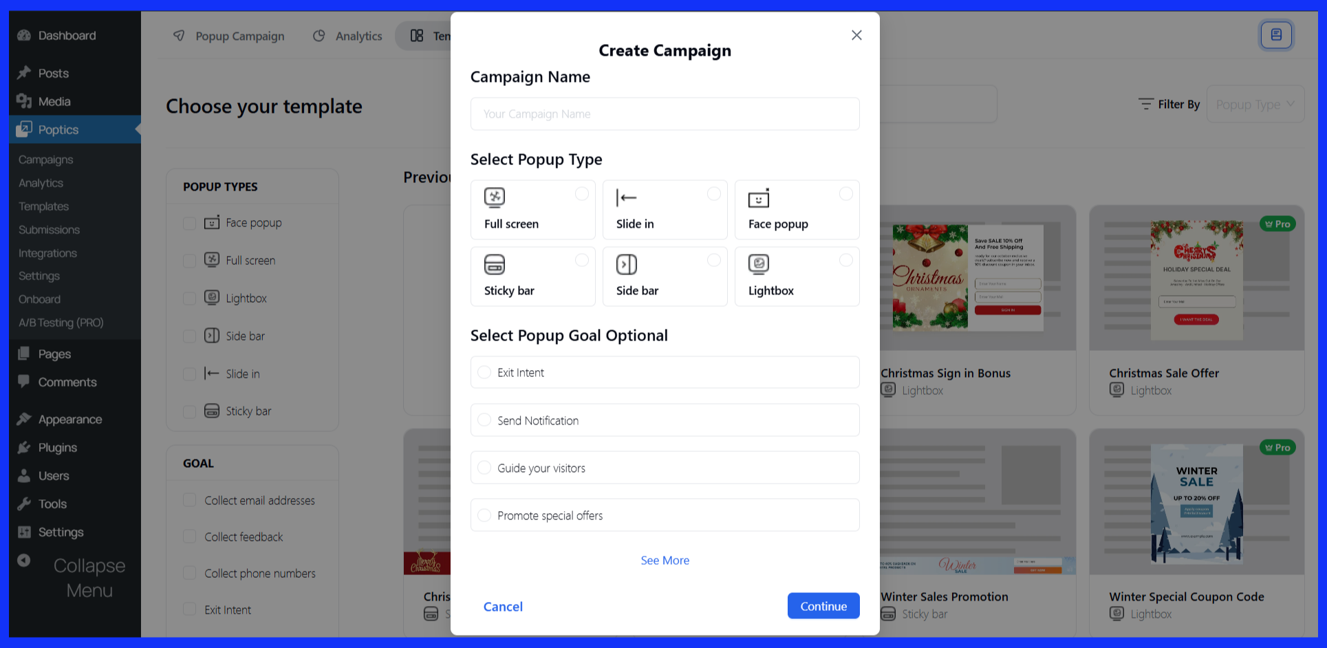
- Enter a Campaign Name and choose your Popup Goal.
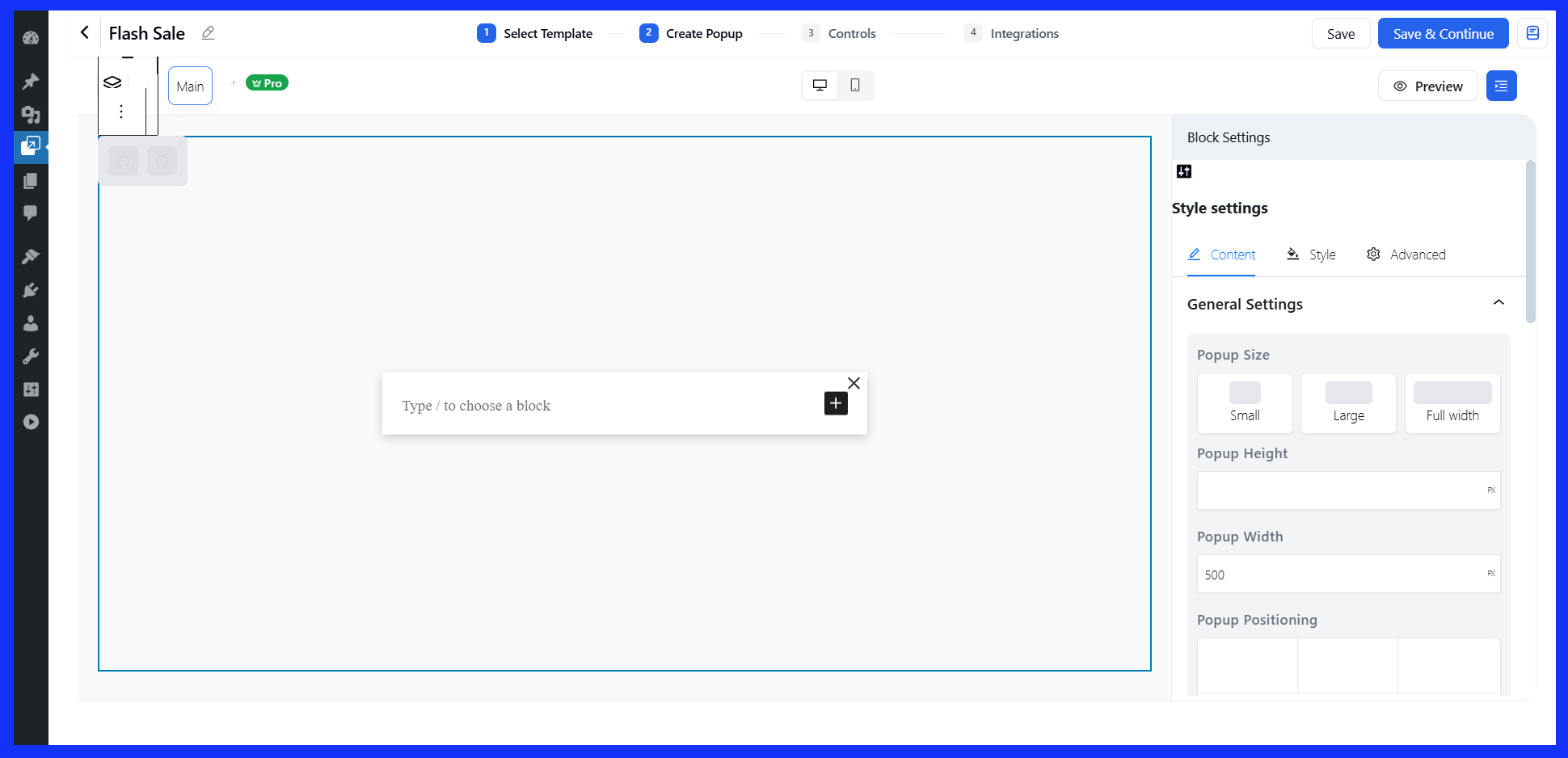
- This opens the popup builder where you can design the layout, add your offer text, and apply styles.
When you’re happy with the layout, click Save & Continue to move on to the control settings.
Choose a pre-made template
- Choose a popup type, your campaign goal, and event type.
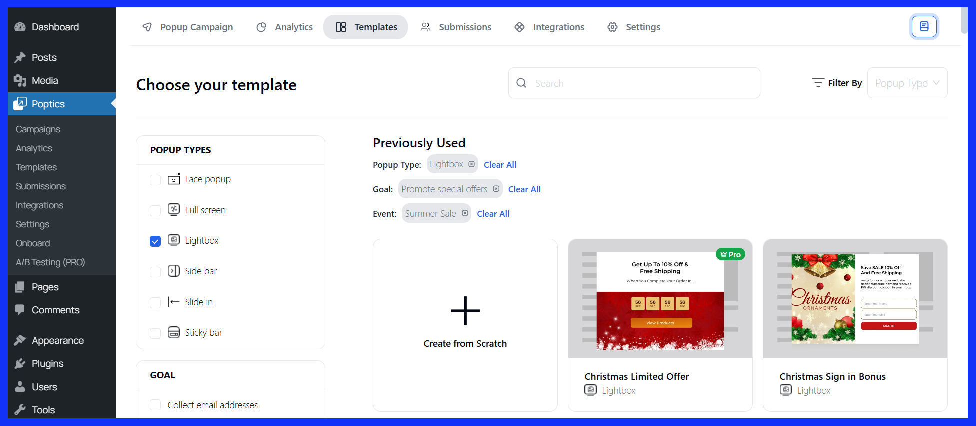
- Next, browse the template library and select one that suits your discount offer.
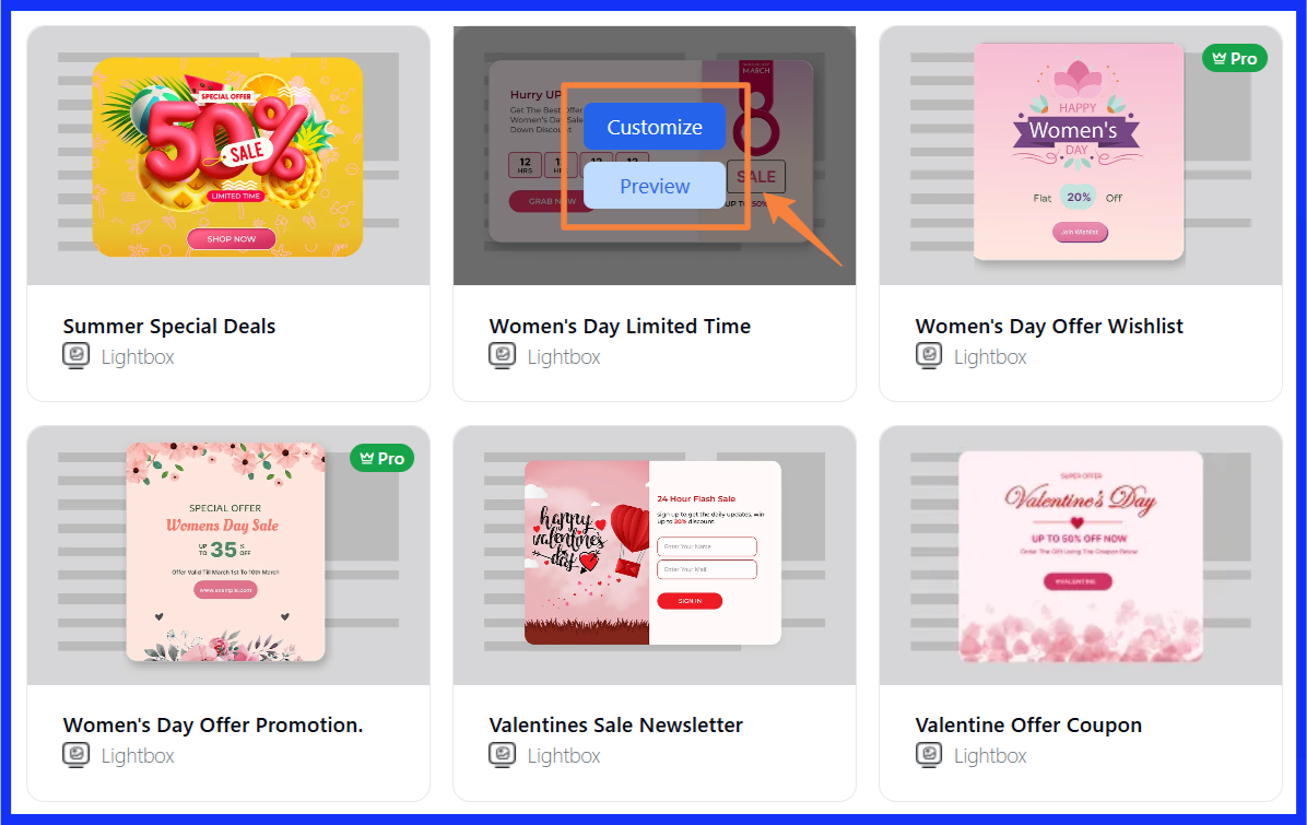
- Click “Customize”, enter your campaign name, and then proceed to the builder.
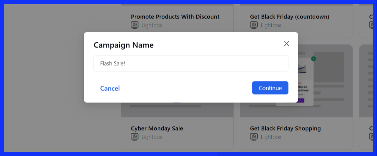
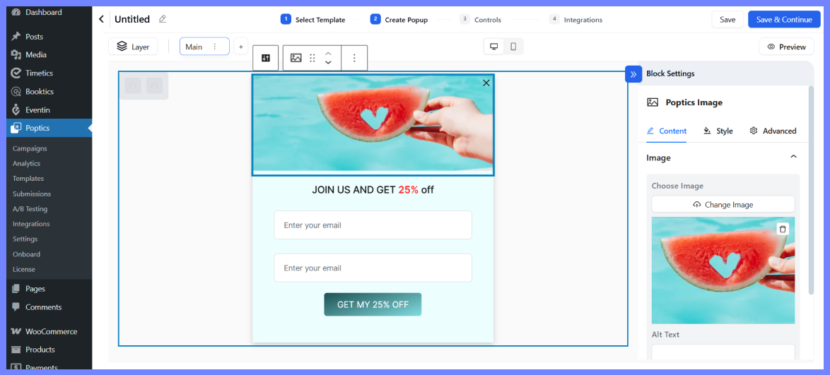
- Once you enter your campaign name, you’ll be taken into the editor where you can make changes just like with a custom popup.
Create a campaign with AI (Pro)
If you’re on Poptics Pro, you can also generate popups using AI. Just choose Create Campaign with AI, type a short prompt (like “Create a popup for 20% off summer collection”), and the builder will generate the design and content for you.
You can still tweak the layout and copy manually once it’s created. But first, you have to integrate OpenAI with Poptics.
So, here is the popup creation process,
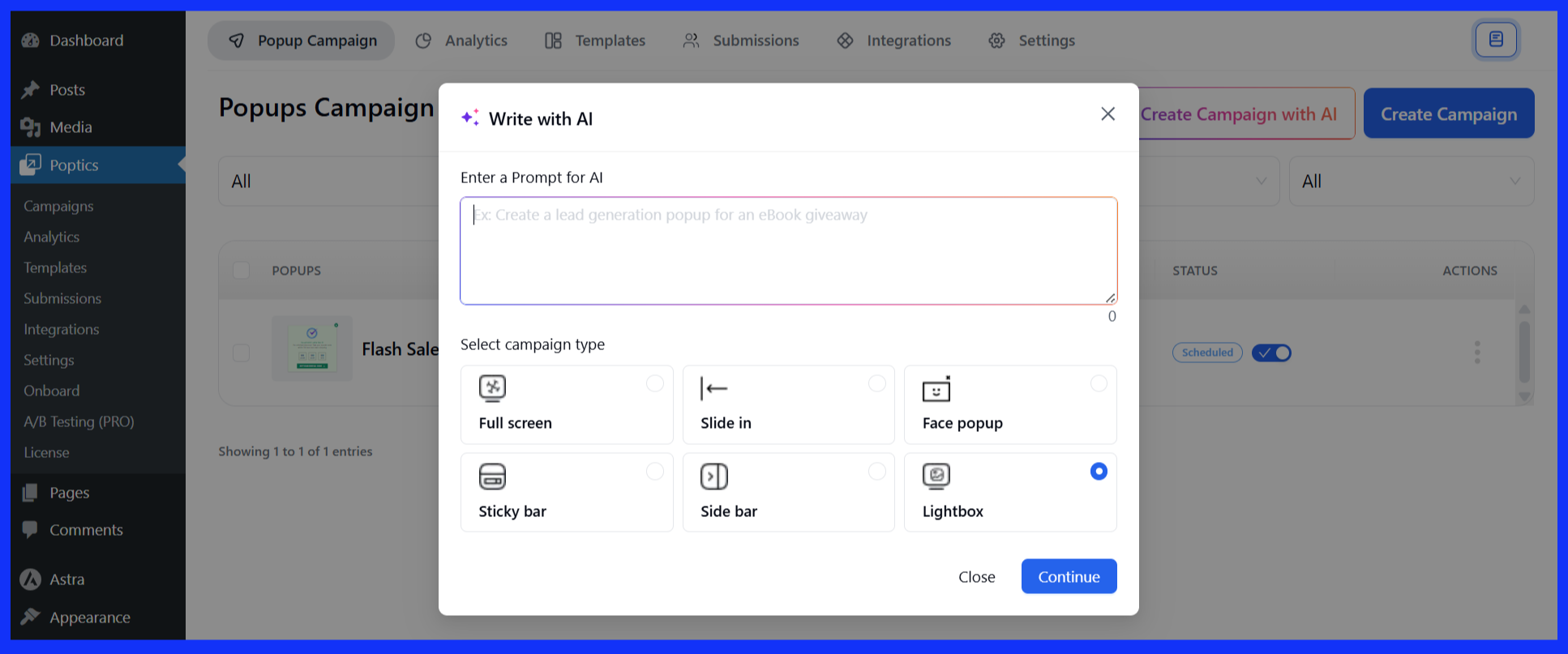
- Select “Create Campaign with AI” from the dashboard.

- Input a short prompt, choose your popup type, and let the AI handle the setup.. Then click on “Continue.”
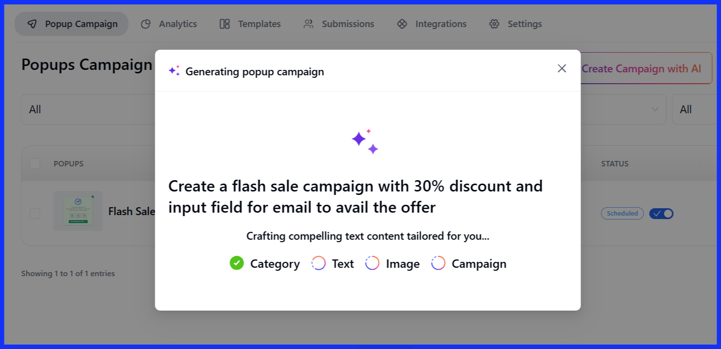
- It will now take some time for the popup creation to be completed according to your input.
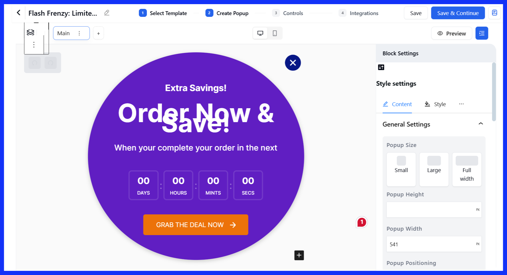
- Once generated, you can fine-tune the design like any other campaign.
Step 4: Customize the popup
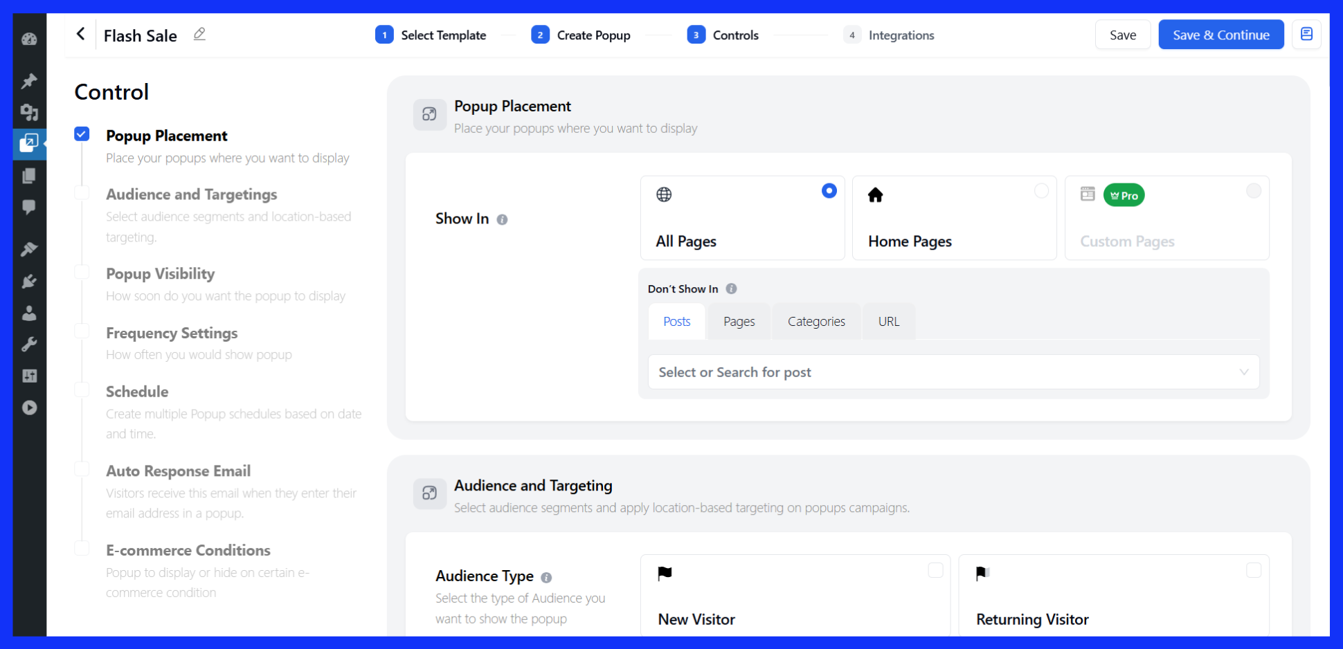
Next, it’s time to decide where, when, and how your popup appears. Poptics gives you options to control:
- Page placement – Choose which pages should show the popup (home, product, checkout, etc.)
- Trigger settings – Show on page load, scroll, or exit intent
- Audience rules – Target visitors by location, device, or referral source
- Frequency control – Limit how often the popup appears
- Scheduling – Set start and end dates for seasonal offers
- Ecommerce conditions (Pro) – Trigger popups based on cart behavior
Once your settings are in place, click Save & Continue.
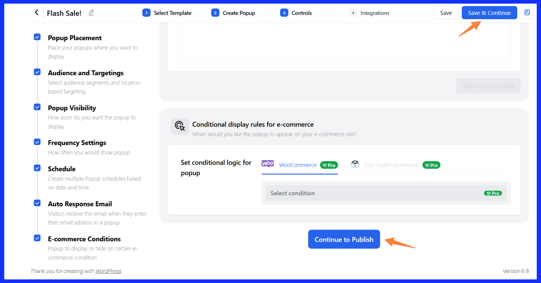
Note: There are numerous settings to explore. Feel free to explore them and try out what works best for you!
Step 5: Configure integration
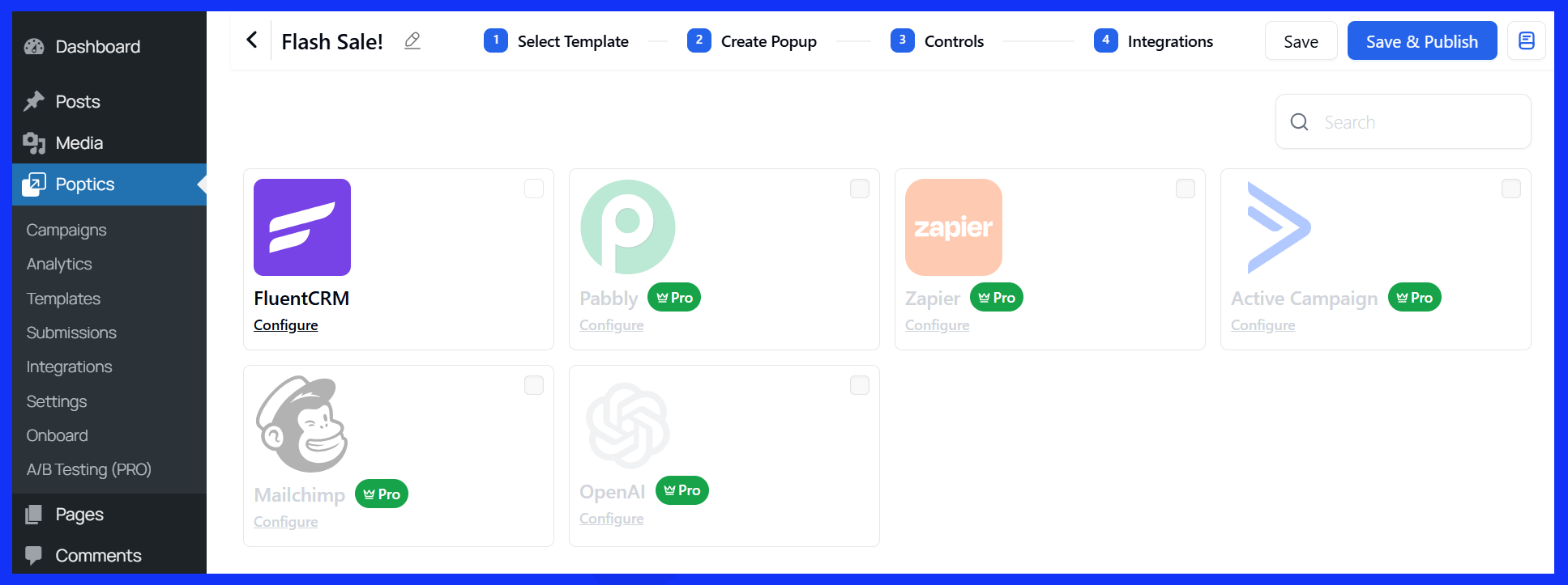
If you’re collecting emails or phone numbers, you’ll probably want to send that data somewhere, like an email tool or CRM.
- Free version: You can connect Poptics with FluentCRM.
- Pro version: Supports tools like Mailchimp, Zapier, Pabbly, and ActiveCampaign.
These integrations help you automate follow-ups and organize leads without manual steps.
Preview and publish
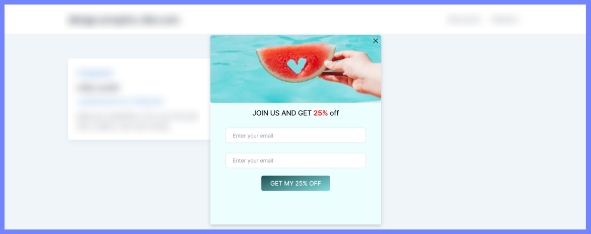
Once you’ve reviewed the content and settings, click Save & Publish. Your popup is now live and will appear based on the rules you set.
Track and measure your popup performance
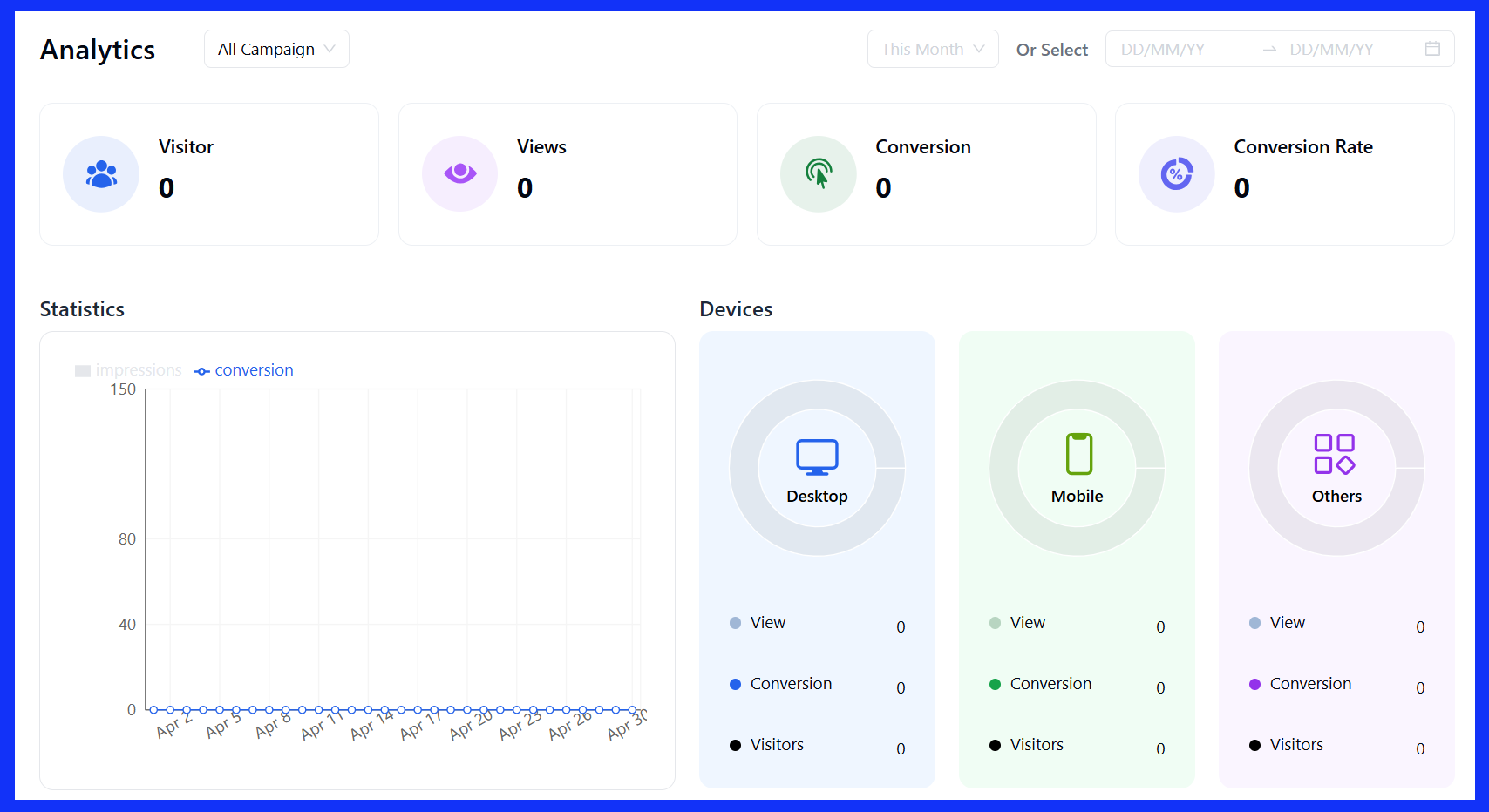
Poptics makes it easy to monitor how your popups are doing, so you can improve results fast. The built-in Campaign Analytics provides you with all the essential insights in one place.
You can check:
- Number of visitors who saw the popup
- Conversion rate (signups, clicks, etc.)
- Device-specific performance
- Location-based data
- Visual charts and comparison filters
Use this data to refine your pop-ups over time and enhance performance.
🌟 Read also: How to Create a Popup Notification in WordPress
Real-world eCommerce popup examples & why they work
Sometimes, the best way to understand how popups work is to see them in action. Below are real examples from eCommerce brands using popups in thoughtful ways, each designed to solve a specific problem or support a clear goal.
1. Outer–List Growth with Segmentation
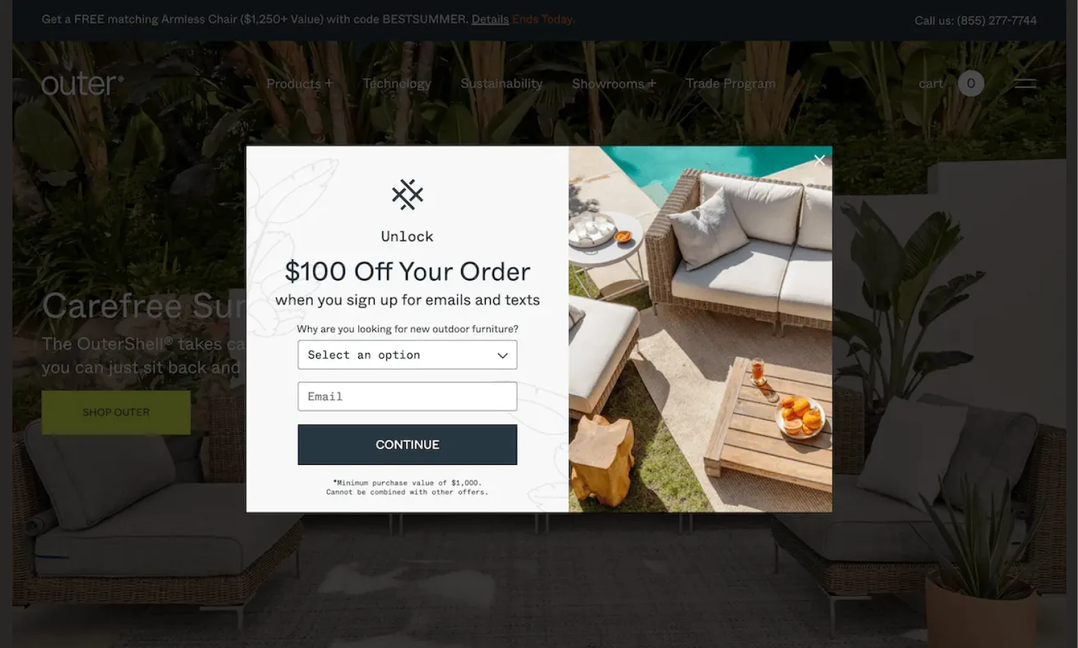
Outer, an outdoor furniture brand, displays a welcome popup to new visitors, using a signup field and a dropdown to create more personalized popups for better targeting.
Why it works:
This popup immediately gets the visitor’s attention without feeling pushy. It also offers value upfront and provides a clear exit in the corner. By including a dropdown about shopping intent, Outer can segment its email list and personalize follow-up emails.
2. High Sierra – Cart Abandonment + Email Capture
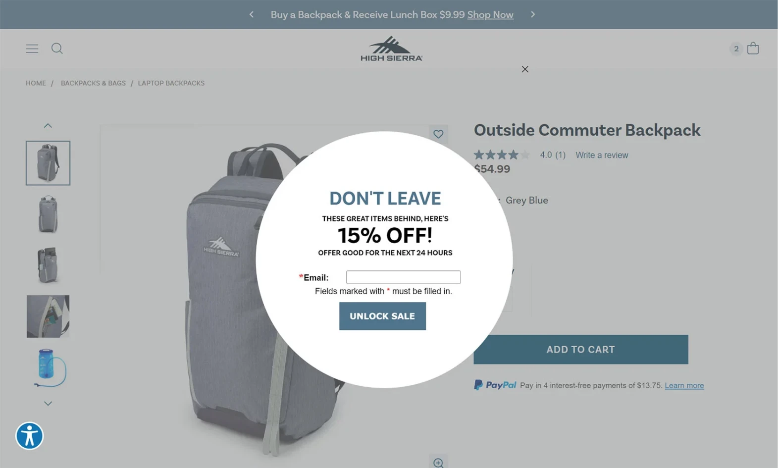
High Sierra combines email capture with exit-based popups when a visitor adds an item to their cart and then shows signs of leaving to fight abandoned carts. Instead of just asking them to complete the purchase, the popup also offers a chance to join the store’s email list.
Why it works:
This popup is doing double duty: it gives one last nudge to save a sale while also building the email list in case the customer doesn’t convert right away. For visitors who haven’t shared their contact info yet, this is a smart way to stay in touch.
3. Bagallery – Discount Promotion Popup

Bagallery uses a full-screen popup to highlight a discount of up to 60%. A clear CTA—“Shop Now”—takes users directly to the deals page.
Why it works:
This kind of promotion grabs attention without being confusing. The design is bold and to the point. There’s a single action to take, which makes it easy for users to jump right into shopping. It’s especially effective during sale periods or clearance events.
4. Campus Protein – Loyalty Program Invitation
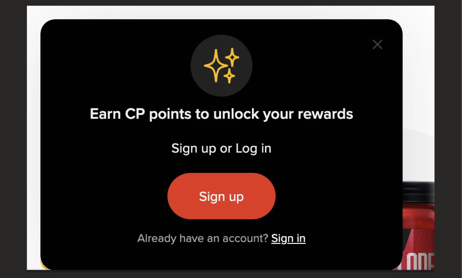
When new visitors arrive, Campus Protein shows a small popup in the corner that invites them to join their loyalty program and start earning points.
Why it works:
This popup does two things well: it introduces long-term value early in the customer journey and sets the stage for account creation. It’s low-pressure and doesn’t distract from shopping, but it still plants the idea of coming back to earn rewards.
5. Darn Good Yarn – Giveaway Exit Popup
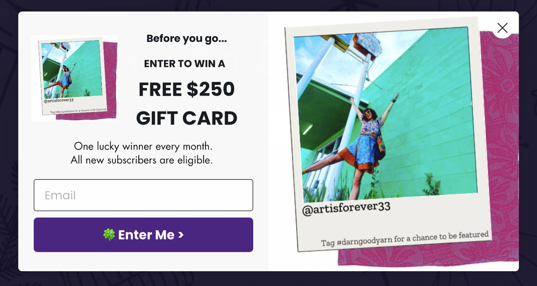
Another exit entend popup from Darn Good Yarn. It triggers when a visitor is about to leave and offers a chance to win a $250 gift card in exchange for entering their email.
Why it works:
It captures attention with a high-value incentive right at the exit point. Even if a shopper wasn’t ready to buy, they’re now more likely to stick around or opt in. It’s also a good way to grow the email list with engaged leads rather than cold traffic.
6. Uniqlo – Full-Screen Popup with a Simple Opt-In Flow
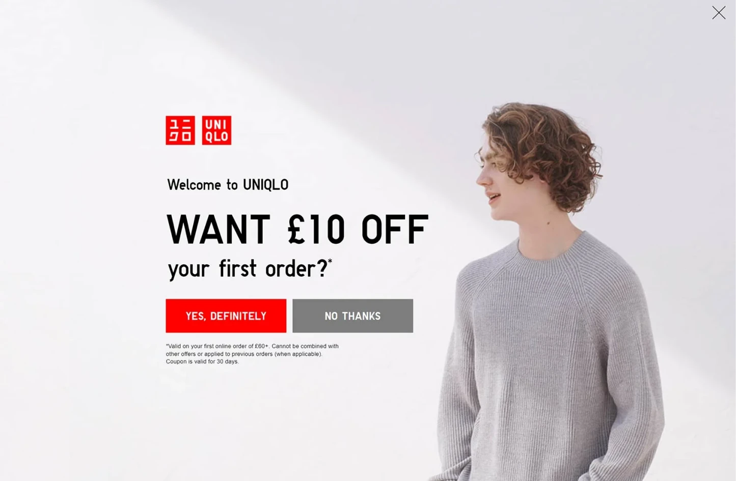
Uniqlo uses a full-screen popup to grab attention and encourage sign-ups with a clean, visually appealing offer. Their popup leads with a small “Yes” interaction, which makes the full email opt-in form feel like a natural next step.
Why it works:
This popup uses a psychological trick known as “micro-commitment”, which is asking a small, low-stakes question (“Want exclusive offers?”) that most people will answer “yes” to. Once someone engages, they’re more likely to follow through with the signup.
7. Urban Outfitters – Bold Offer with Save-for-Later Option
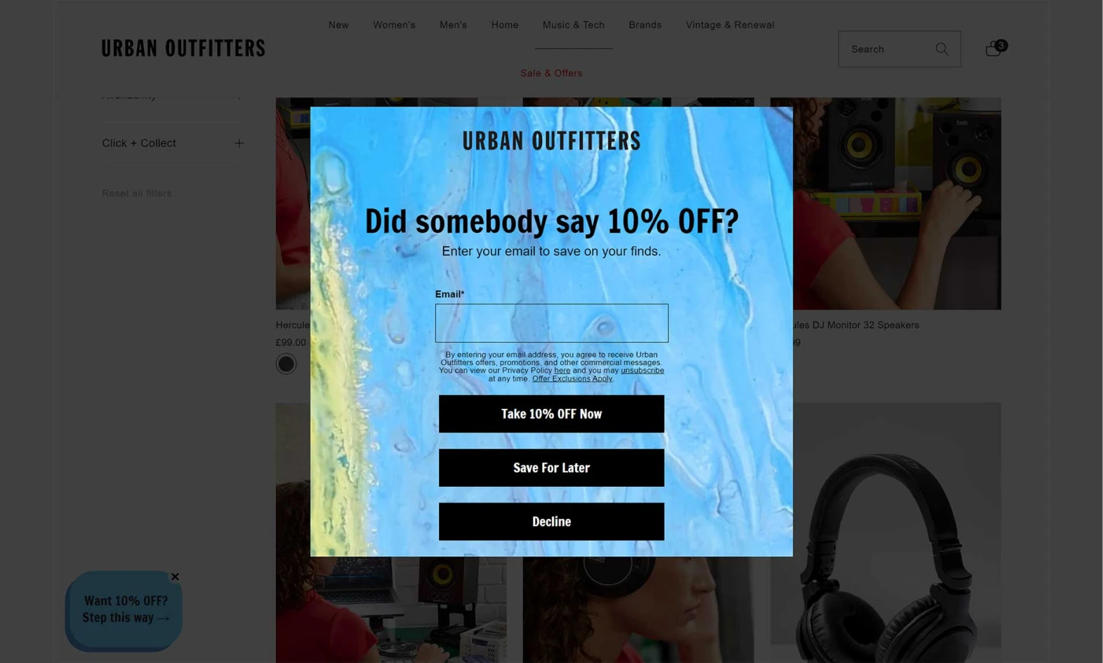
Urban Outfitters uses a lightbox-style discount popup to dim the background and highlight a bold offer in the center of the screen. Alongside the main call-to-action, the popup includes an option for visitors to save the offer for later as a strong part of the customer experience.
Why it works:
The lightbox overlay draws attention to the offer without being aggressive. What really stands out, though, is the save-for-later option. It’s a smart way to reduce pressure while still capturing interest, especially from visitors who aren’t ready to buy now but don’t want to lose out on a discount.
🌟 Good read: 25+ Proven Lead Generation Headlines and Form Creation Guide
Best practices to maximize the impact of your eCommerce popups
Popups can be helpful or distracting; it all depends on how you use them. Below are some practical tips to help your popups work better for both your visitors and your goals.
Popup timing matters more than most people think. If shown too early, it can feel intrusive; too late, and the visitor may already be gone.
- Give people a little time before showing a popup: Popup timing matters more than most people think. If shown too early, it can feel intrusive; too late, and the visitor may already be gone. Nobody likes being asked for something the moment they land on a page.
- Keep the message clear and simple: If you’re building email popups, keep the message tight and relevant. Too much text or too many steps in the signup field can lower your conversion rates.
- Use one goal per popup: Each popup should have a single purpose, like collecting emails, offering a discount, or recommending a product. If you ask for too many actions at once, people are more likely to close the popup without doing anything.
- Make it easy to close: Always give visitors a way to dismiss the popup. Make the “X” icon easy to find, and consider offering a “No thanks” button with a neutral tone.
- Match the popup design to your store: A popup that looks and feels like part of your site is more likely to build trust. Use your store’s colors, fonts, and imagery to strengthen the customer experience.
- Don’t overdo it: Too many popups can overwhelm visitors and hurt the overall experience. It’s better to show fewer, more targeted popups than a bunch of generic ones.
- Test and adjust over time: What works for one site might not work for another. Keep an eye on your popup stats like views, clicks, and conversions, and run A/B tests to improve results. Test different headlines, offers, triggers, and designs one at a time so you can see what’s making a difference.
- Make sure mobile-friendly popups: A popup that looks fine on a desktop may not work on phones. Test your design across all devices. Also, keep your mobile popups readable, and avoid blocking live chat or self-service chat tools.
Want to go deeper? Here’s a quick guide on how to attract visitors with popups that actually work.
Common eCommerce popups mistakes & how to avoid them
Even with the best intentions, it’s easy to overdo popups or miss small details that make a big difference. Below are some common mistakes store owners make and what you can do instead.
1. Showing a popup too soon
If a popup shows up as soon as someone lands on your site, it can feel a bit sudden. They haven’t even seen what you offer yet, so asking them for something right away might not work.
What you can do: Wait a few seconds or let them scroll a bit first. Give them a moment to look around before showing your offer.
2. Offering the same popup to everyone
Not all visitors are at the same stage. A returning customer doesn’t need a first-time discount. And someone browsing on mobile might prefer a shorter message than someone on a desktop.
What you can do: Segment your audience. Show different popups based on location, cart value, device type, or browsing behavior.
3. Making it hard to close
If visitors can’t easily dismiss a popup, especially on mobile, it creates frustration fast. Sometimes this leads people to leave the site altogether.
What you can do: Always include a clear, visible close button (the “X” in the corner), and make sure it’s easy to tap on smaller screens.
4. Using too many popups at once
Stacking multiple popups on top of each other or triggering different ones too often makes the site feel cluttered. It also hurts your message’s impact, ruins the flow, and hurts the overall customer experience.
What you can do: Stick to one popup per page or session, and use frequency limits to space things out. For multi-step campaigns, consider combining messages into one popup flow.
5. Relying too heavily on discounts
While discounts can help with conversions, leaning on them too much can train visitors to wait for deals instead of buying at full price. Instead, focus on clean offers that improve—not interrupt—the customer experience.
What you can do: Mix in other types of popups like early access offers, product recommendations, or value-driven content signups.
6. Ignoring mobile experience
A popup that looks great on a desktop might be hard to read or interact with on a phone. This can lead to missed conversions or worse, annoyed visitors.
What you can do: Always preview your popups on different screen sizes, and adjust the layout, font size, and spacing for mobile users.
7. Skipping the follow-up
Getting someone to opt in is excellent, but if you don’t follow up quickly, that momentum can disappear. Popups should tie into an email or SMS strategy.
What you can do: Connect your popup to an email platform or CRM so you can send welcome messages, discount codes, or order reminders automatically.
🌟Read also: What is Flash Sale Popup? How to Create Flash Sale Popup in WordPress
Conclusion
Popups don’t have to be complicated or annoying. When used the right way, popups can actually help shoppers to make better purchasing decisions.
Start with a clear goal, pick the right type of popup, and show a message that fits the moment. Also, keep it simple, then test and improve as you go. Your average order value will increase dramatically, which will eventually boost conversion rate and customer experience as well.
If you’re using WordPress and want a simple way to get started, tools like Poptics make the setup easier. If you wish to welcome new visitors or recover abandoned carts, you can build high-converting popups in minutes.
Want to give it a try? 👉 Install Poptics and create your first ecommerce popup — it’s free to start.

