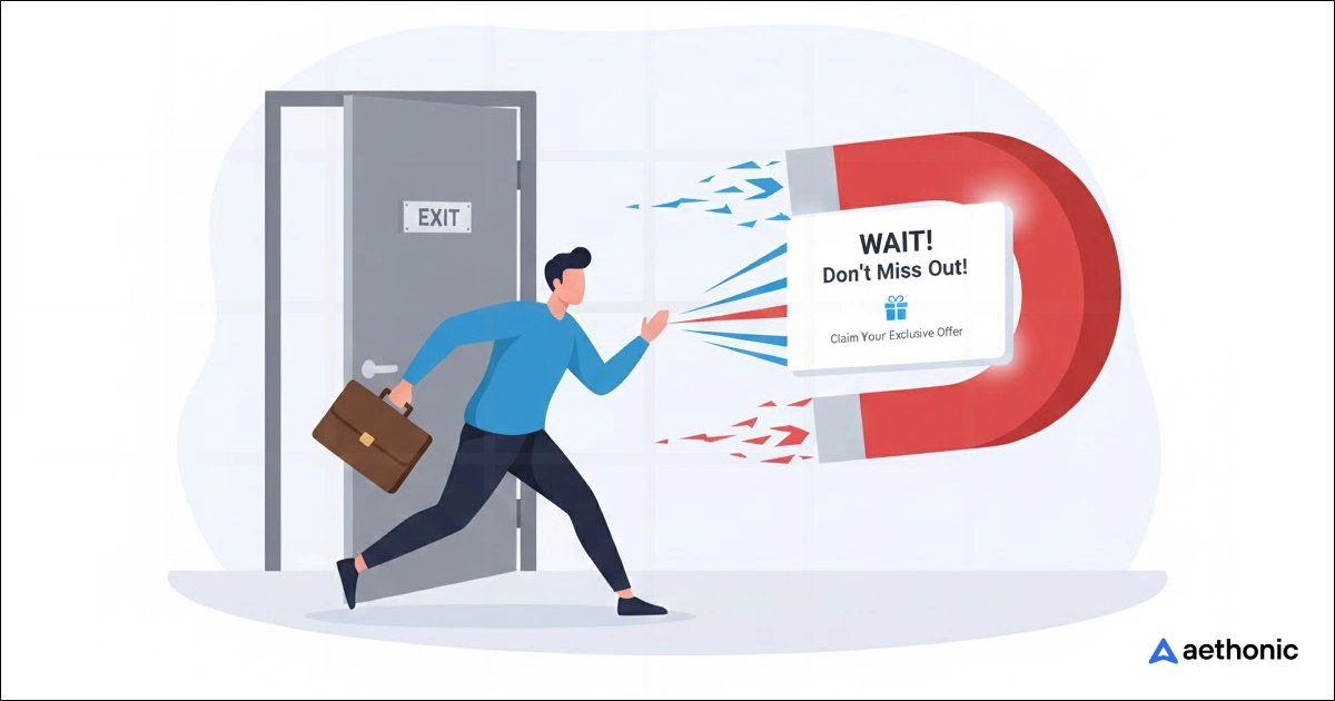
40 Exit-Intent Popup Ideas to Stop Visitors from Leaving

When someone leaves your website before purchasing anything, you might have one last chance to bring them back, with the help of an exit-intent pop-up.
Good idea, right? Let me explain a little bit more clearly.
An exit-intent popup is a small message that pops up when someone is about to leave your website. It notices things like when people move their mouse toward the close button or swipe up on their phone, and then shows a message right before they go.
The goal is simple: stop visitors for a moment and give them a reason to stay. You can use it to offer a discount, remind them about their cart, share a free guide, or invite them to join your newsletter.
A well-timed message can turn them into buyers, subscribers, or loyal visitors.
In this guide, I’ll share 40 exit-intent pop-up ideas that help you keep visitors longer, recover lost sales, and grow your business without annoying your audience.
Do exit-intent popups really increase conversions?
Absolutely, exit-intent popups increase conversions. This pop-up type grabs attention better than almost any other one.
The idea is simple. When someone’s about to leave, the pop-up shows up at the right moment, not too early, not too late. That timing makes all the difference.
Most users don’t mind a quick message if it gives real value, like a discount, a bonus, or a helpful reminder.
Think about it. A visitor might be seconds away from closing your site, but an exit popup offering 10% off or a free resource can make them stay just a bit longer.
That extra moment often turns into a click, a signup, or even a sale.
Exit-intent popups increase conversions because they:
- Catch attention at the right time- It’s the last window before losing a visitor completely.
- Offer clear value- People love to feel they’re getting something extra before leaving.
- Win back lost sales- Many people leave items in their cart, but a small reminder can bring them back.
- Encourage engagement- Even if they don’t buy, they might leave their email for updates.
- Keep visitors on your site longer- If someone stays even 10 more seconds, they are more likely to do something you want.
The point is, exit-intent popups turn “lost” traffic into second chances, and those second chances often lead to real conversions.
40 ways to win back leaving visitors with exit-intent popups
Awareness & engagement popups for better results (Catch attention first)
1. Show new popups to existing subscribers
Many websites make this common mistake, showing the same generic popup to everyone, even those who already subscribed or purchased.
That doesn’t help. In fact, it frustrates users.
Instead, use smart targeting. Detect returning visitors or logged-in users and show something fresh.
For example:
- A thank-you message like “Good to see you again! Here’s 10% off your next order.”
- A new feature announcement or upcoming sale.
- A referral link that rewards them for inviting friends.
It makes loyal users feel noticed instead of ignored.
2. Offer a free guide or checklist
If your visitors came for information, don’t just let them go empty-handed. Give them a free, useful resource.
A simple guide, checklist, or cheat sheet can make them stay longer or join your email list.
Let’s say your site talks about marketing — you could show a popup like:
“Wait! Want our free 10-step marketing plan template?”
It’s not pushy, but it delivers real value. The visitor leaves feeling like they gained something, and you get a new lead.
3. Invite to join the newsletter
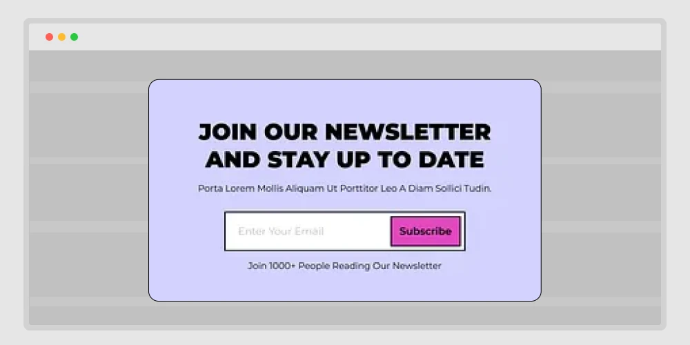
Not every visitor is ready to buy on the first visit. That’s normal.
But you can still build a connection by inviting them to join your newsletter before they leave.
Keep it friendly and short — no complicated forms.
- Tell them what they’ll get: “Weekly tips, latest deals, or exclusive resources.”
- Add social proof: “Join 8,000+ marketers who get our updates.”
- Make the button personal: “Yes, send me updates!” instead of “Subscribe.”
This kind of popup turns cold visitors into warm leads you can reach late
📚 Related reading: How to Create a Popup Notification in WordPress: Step-by-step guide 👉 Read more
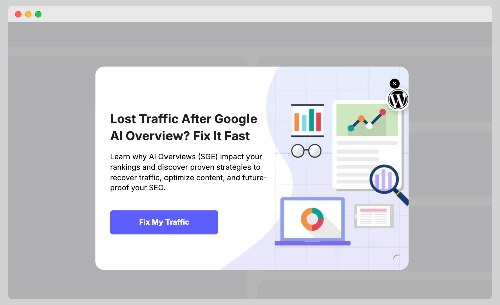
4. Offer a content upgrade tied to the page
A content upgrade means giving something extra that matches what they’re already reading.
If your visitor is on a blog about “Email Marketing,” the popup could say:
“Download our free email subject line swipe file before you go!”
It works because it’s relevant and feels natural. They’re already interested in the topic, so offering a bonus feels like a smooth continuation, not an interruption.
You can use this strategy on almost any blog post or tutorial to increase your email signups fast.
5. Invite to a live webinar
Sometimes, people don’t want to read more; they want to see how something works.
An exit-intent popup can invite them to join a live session or demo where they can ask questions and get real examples.
For example:
“Join our free 30-minute webinar: How to Create High-Converting Popups That Work.”
Webinars are great because they move users from reading to interacting. Even if they don’t buy right away, they get familiar with your product and trust grows naturally.
6. Use a short quiz to suggest products
People like interaction, not static content. A quiz makes the experience more personal.
Imagine a popup saying:
“Not sure which plan fits your needs? Take our 20-second quiz.”
The quiz could ask two or three quick questions about their goals, then show the best plan or product.
It’s useful for SaaS tools, online courses, or eCommerce stores with multiple options.
Instead of leaving confused, the visitor feels guided — and that’s how conversions happen.
7. Ask why they are leaving with quick options
Sometimes, it’s not about selling, it’s about learning.
When you know why visitors are leaving, you can fix the root problem.
A polite popup can ask:
“Before you go, could you tell us what made you leave?”
Then show simple options like:
- Just browsing
- Couldn’t find what I wanted
- Prices too high
- Page took too long to load
This kind of feedback helps you improve user experience and build trust. Some users even appreciate that you care enough to ask.
8. Run a quick two-question survey
Different from the “why leaving” popup, this one aims to collect opinions instead of problems.
Ask easy questions like:
- How helpful did you find our content today?
- Would you visit again?
Keep it short so it doesn’t feel like work. After submission, you can say thank you and offer a small reward like “Here’s a 10% coupon for your feedback!”
This keeps your visitors engaged while giving you insights to improve your site.
📚 Related reading: The Psychology Behind Successful Popup Ads: How to Grab Visitor’s Attention 👉 Read more
9. Offer help via live chat
Many people leave websites simply because they can’t find what they’re looking for.
An exit popup offering instant help can fix that.
Imagine this:
“Need help before you go? Our team can answer your question right now.”
It’s direct, human, and shows you care.
This approach works best on pricing, checkout, or contact pages where hesitation is high.
You can even combine it with chatbots that trigger pre-written responses to save time.
10. Offer WhatsApp or Messenger support
Not everyone likes using live chat forms — especially mobile users.
Adding WhatsApp or Messenger buttons to your exit popup makes it easier for visitors to contact you through apps they already use daily.
For example:
“Still have questions? Chat with us on WhatsApp!”
It creates a personal touch. Plus, you can keep the conversation going even after they leave your site.
This is perfect for service-based businesses, local stores, or brands that rely on 1-to-1 communication.
Conversion boost (Recover sales or signups)
11. Give a reminder of items in cart (short story + example)
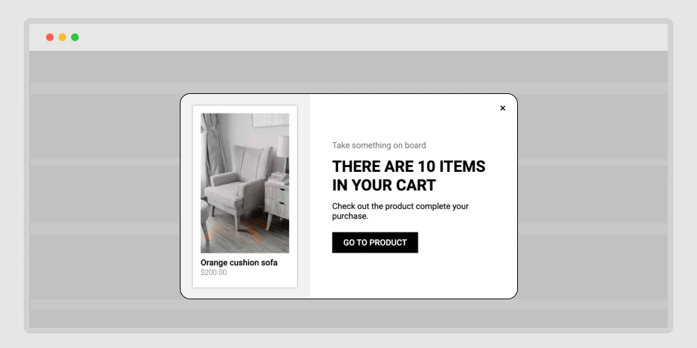
Someone adds two items, checks shipping, then gets a phone call. They close the tab.
Your exit popup appears:
“You have 2 items in your cart. Ready to check out now?”
Show product thumbnails, the total, and a single button: continue to checkout.
Add a small line under it: “We’ll save your cart for 24 hours.”
That lowers stress and brings them back with one click.
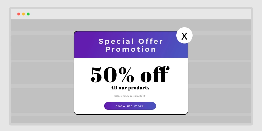
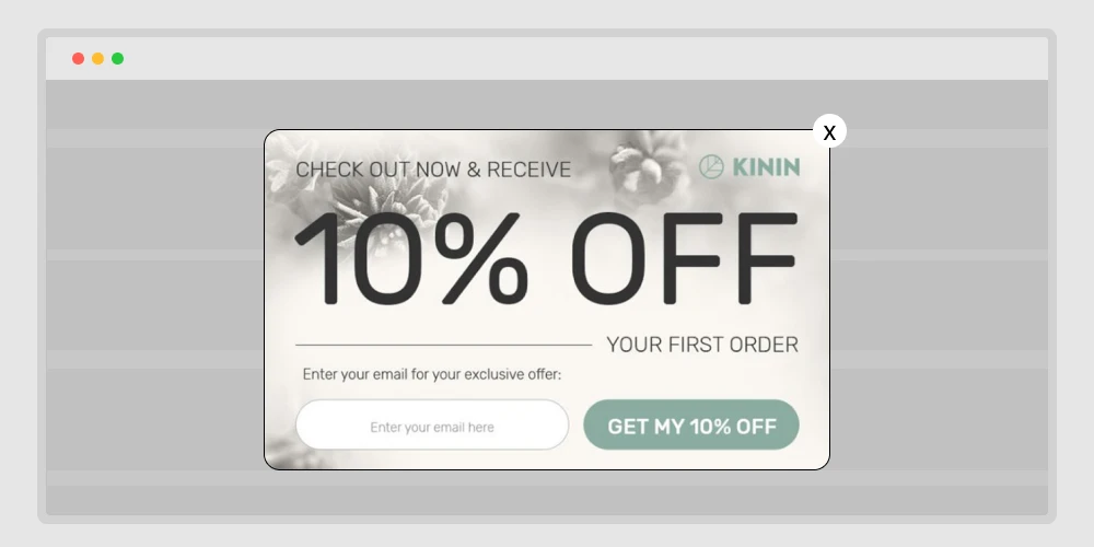
12. Offer a first order discount(definition + simple frame)
Let’s be honest — most first-time visitors hesitate. They browse, compare, and then leave without buying. That hesitation usually comes from one thing: uncertainty.
A first-order discount helps break that wall. It’s not about giving away money; it’s about showing a warm welcome.
You can start simple:
“Hey, thanks for stopping by! Here’s 10% off your first order — just to get started.”
Or make it feel more personal:
“Your first visit deserves something special. Use code WELCOME10 at checkout.”
If you want to go beyond a static offer, try adding these small touches:
- A short timer — “Offer ends in 15 minutes.”
- A clean visual — highlight the discount percentage, not cluttered graphics.
- Optional email capture — but make it one field only.
This kind of popup doesn’t pressure the user. It feels like a friendly gesture — a small push that says, “Give us a try.”
And when done right, that one-time welcome can turn curious visitors into long-term customers.
13. Offer free shipping before they leave (problem → solution → copy block)
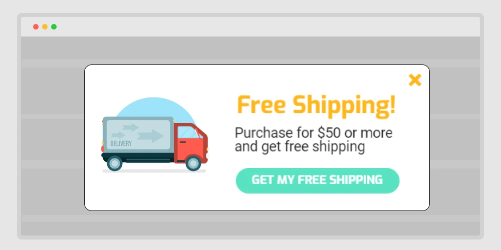
Think about how many times you’ve almost checked out, then saw the shipping cost and thought, “Maybe later.”
That’s exactly what your visitors feel too. Shipping fees are one of the biggest reasons people abandon their carts.
An exit-intent popup offering free shipping can change that decision in a second. It feels like a friendly surprise — not a sales trick.
You can show something simple like:
“Wait! You qualify for free shipping today only.”
Or even better:
“Don’t leave your cart behind — free shipping is unlocked for the next 15 minutes.”
It’s quick, clear, and gives them an instant reason to stay.
If full free shipping isn’t possible, don’t worry. You can still make it sound positive:
- “Free shipping on orders over $50.”
- “Add one more item to unlock free delivery.”
- “VIP members get free shipping — join now.”
These small, kind offers work because they remove friction. People love to feel they’re saving something — even if it’s just delivery fees.
A well-timed free shipping popup often turns “I’ll come back later” into “Okay, I’ll buy it now.”
📚 Related reading: 750+ High-Impact Marketing Power Words to Grab Attention Instantly: For Social Media, Online Sales, Email, and Website 👉 Read more
14. Add urgency with a countdown timer (explanation + micro-guidelines)
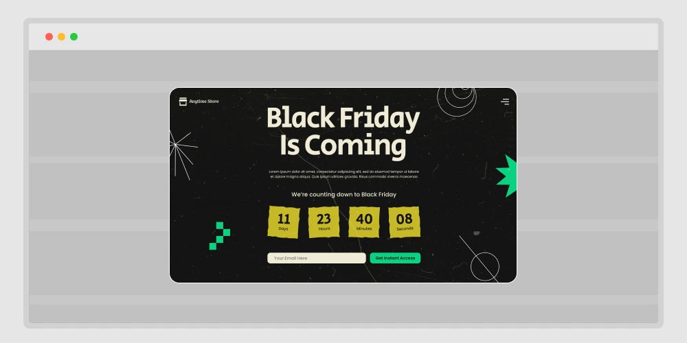
When people feel they have plenty of time, they delay decisions.
But when there’s a visible clock ticking, the brain reacts differently — it wants to act before time runs out.
That’s why adding a countdown timer to your exit popup can work so well. It adds a light sense of urgency without sounding pushy.
Imagine a popup like this:
“Wait! Your 15% discount ends in 10:00 minutes — complete your order now.”
The timer doesn’t have to flash or blink; it just quietly reminds the user that this offer won’t be here forever.
It turns hesitation into action.
A few ways to make countdown timers feel natural:
- Use them only for real, time-based offers (don’t fake it).
- Keep the design clean — one color, one CTA.
- Set short timeframes like 5–15 minutes.
- Test phrases like “Offer expires soon” instead of shouting “Hurry up!”
Done right, a countdown timer doesn’t scare visitors.
It helps them make a quick choice while they’re still interested — and that’s the real goal of good marketing.
15. Show a low stock alert (definition + use cases + safety note)
People hate missing out; it’s human nature.
When visitors see that an item is almost gone, it sparks a sense of urgency. They stop scrolling and think, “Wait, I should grab this before it sells out.”
That’s exactly what a low stock alert popup does. It doesn’t push; it informs. It gently reminds users that others are buying too, and the chance won’t last forever.
You can keep it short and real:
“Only 3 left in stock — grab yours before it’s gone.”
If you sell event tickets or limited offers, try:
“Almost sold out! Only a few seats left for this event.”
Some extra tips to make it effective:
- Use real inventory data — fake urgency breaks trust.
- Pair it with a product image or price to reinforce interest.
- Add a direct call-to-action button like “Get it now” or “Reserve my spot.”
This type of popup works best for physical products, courses, or event registrations. It plays on natural fear of missing out — but in a fair, honest way.
A simple “low stock” message can do what long sales pages can’t — help someone decide right now.
16. Reveal a surprise coupon (interactive style + example flow)
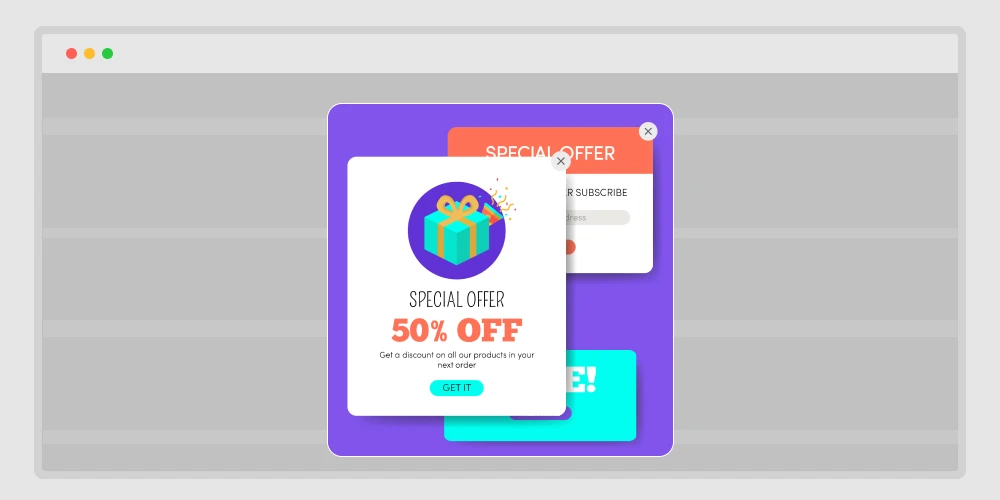
Everyone likes surprises — especially the kind that save money.
Instead of showing a plain discount, make it feel like a small reward. This keeps users curious and excited to click.
Think of it as turning your popup into a mini game.
When someone tries to leave, your popup could say:
“Don’t go yet — click to reveal your secret offer!”
Then, after a short animation or flip effect, reveal something like:
🎁 “You’ve unlocked 15% off — use code SECRET15 at checkout!”
Why it works:
- Curiosity makes users interact instead of instantly closing the popup.
- The “reward” effect creates a little dopamine hit — it feels like winning.
- It adds emotion to a routine message, making the moment memorable.
You can try different reveal styles too:
- A “scratch card” effect where users rub to see the offer.
- A spin wheel with random prizes.
- A simple “click to reveal” button for clean designs.
This tiny bit of interaction turns an ordinary exit popup into a fun experience — and that’s what makes people stay longer and buy more.
📚 Related reading: 25+ Proven Lead Generation Headlines and Form Creation Guide (Tutorial) 👉 Read more
17. Offer a bundle suggestion (value framing + sample layout)
Sometimes people leave because one product doesn’t feel like enough. Maybe they wanted more value for the price, or maybe they just didn’t realize how your products work better together.
That’s where bundle popups come in. Instead of letting them go, use your exit popup to say:
“Want the full experience? Get the complete bundle and save 25%.”
You can show a few items together — maybe the main product plus one or two related ones ,and a small note that highlights savings, like “Save $18 compared to buying separately.”
It’s not about pushing more products. It’s about showing a smarter choice. You’re helping customers see that the bundle gives more for less.
For example:
- If you sell software, you can bundle tools that complement each other — like analytics + automation.
- If it’s an online store, offer a combo like “Camera + Tripod + Carry Bag.”
- For event platforms, you could show “Main Event Ticket + VIP Pass.”
Tips to make it work well:
- Keep the bundle price visible and savings clear.
- Add a single “Upgrade to Bundle” button.
- Use clean visuals — not too many items or words.
18. Cross-sell a cheaper alternative (contrast table + copy cue)
Sometimes visitors leave not because they don’t like your product — but because it feels too expensive right now.
That’s okay. Not everyone is ready for your premium plan or full-priced item.
Instead of losing them completely, use your exit popup to suggest a cheaper or lighter alternative. This small act of understanding can keep users on your site and still lead to a sale.
You can present it like this:
| option | price | best for |
| pro | $49/mo | teams and heavy use |
| basic | $19/mo | solo users and |
Then add a short message underneath:
“Need something lighter? Try basic. You can upgrade anytime.”
The goal is to keep them in, not push down value.
19. Offer flexible payment info (explanation + trust elements + example)
Price can be a real deal-breaker. Sometimes visitors love what they see but just can’t pay all at once — especially for high-value products or yearly plans. That hesitation is your chance to help, not pressure.
An exit-intent popup offering flexible payment options can change how people feel about the purchase.
Try something simple and reassuring like:
“Good news! You can split your payment into 3 easy parts — no extra fees.”
Or make it visual:
| Total | Payment plan |
| $120 | 3 × $40 monthly — ships today |
It instantly makes the offer feel lighter and more manageable.
You can even highlight trusted payment partners like Stripe, PayPal Pay Later, or Klarna for extra confidence.
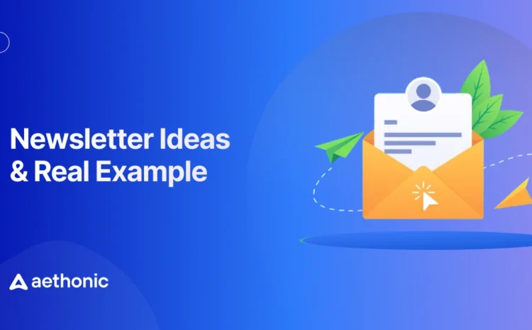
📚 Related reading: 30 Newsletter Ideas to Keep Subscribers Clicking, Reading & Buying 👉 Read more
20. Send a price drop alert signup (use case + copy variants + follow-up path)
Some visitors like the product but want a better price. Don’t lose them. Keep the intent.
Copy variants:
- “Want a heads-up when the price drops? Leave your email.”
- “Get notified first if this goes on sale.”
- “Track this item. One email, no spam.”
Follow-up path:
- confirm the alert
- send a reminder on drop
- add a short deadline in the email to encourage action
This turns “not now” into “notified soon,” which often converts later.
Checkout recovery popups for last-minute buyers (Encourage quick action)
21. Rescue checkout with a one-click link
Imagine someone is at the last step — products added, form filled, and then they suddenly close the tab.
A smart exit popup can save that moment by offering a one-click return to checkout.
You can write something like:
“Hey, your order’s almost ready! Click below to complete your checkout in one step.”
Why it works:
- It removes effort. No one wants to re-enter details again.
- It feels like a personal reminder, not a push.
- It helps finish what they already started.
A “resume checkout” button takes them right where they left off — and that tiny convenience often wins the sale.
22. Show trust badges and refund policy
Some visitors leave because they’re not sure if your site is safe or legit.
An exit popup showing trust badges, secure payment icons, and a clear refund policy can calm that fear.
Example message:
“Your payment is 100% secure. And if you’re not happy, we offer a full 30-day refund — no questions asked.”
This isn’t a discount or offer — it’s reassurance.
You’re telling the user, “You can trust us.” And that’s often all they need to continue.
23. Offer a simple plan comparison
Too many choices can confuse users. If you sell plans or packages, show a quick side-by-side comparison before they leave.
Example layout inside your popup:
| Plan | Price | Features |
| Basic | $9/mo | 1 website, email support |
| Pro | $19/mo | 5 websites, priority support |
Then add a line like:
“Not sure which one fits you best? Most customers choose Pro.”
That little sentence — “most customers choose…” — gives social proof and simplifies their decision.
24. Show social proof from real buyers
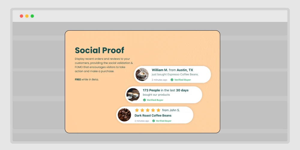
This one’s simple but powerful. People trust people.
Use your exit popup to display real testimonials or quick review quotes.
For example:
⭐⭐⭐⭐⭐ “Best booking plugin I’ve used — setup took less than 5 minutes.” — Sarah L.
It’s short, believable, and doesn’t require scrolling.
Even one or two reviews in a popup can rebuild confidence and stop users from leaving uncertain.
25. Show recent reviews for this product
Different from general social proof — here, you show product-specific feedback.
When visitors are about to leave a product page, pop up a small box that says:
“John just bought this 2 hours ago.”
“Aisha from Canada rated this 5 stars.”
You can even automate it using real purchase data.
These small cues remind users that others are buying too — it’s safe, it’s real, and it’s working.
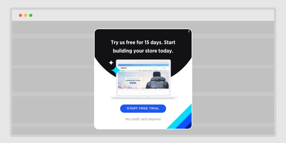
26. Offer a demo or free trial
When someone hesitates on a software or digital tool, it’s often because they’re unsure how it works.
An exit popup inviting them to try a free demo removes that fear.
Here’s a clean example message:
“Still not sure? Try it free for 7 days — no credit card needed.”
You’re lowering the entry barrier.
Once users see the value for themselves, the conversion from trial to paid becomes natural.
27. Invite to book a quick call
Sometimes people leave because they want clarity before buying.
So instead of pushing an offer, offer your time.
A friendly message like this works great:
“Need help choosing the right plan? Book a free 10-minute call with our team.”
Then include a small button linking to your booking calendar (like Timetics or Booktics 😉).
It’s personal, it’s human, and it builds real trust — especially for B2B or service websites.
28. Offer a lower-priced starter plan
Let’s be honest — not everyone is ready for your premium offer.
An exit popup showing a smaller, cheaper version helps keep them in.
Here’s how to frame it:
“Not ready for the full plan? Start small with our Lite version — same quality, lower price.”
This does two things:
- It keeps the user from leaving entirely.
- It shows flexibility — your brand fits different budgets.
Even if they start small, you can always upsell later when they’re ready.
Lead capture & retention popups for lasting connections (Keep visitors in touch)
29. Save the cart and send by email
This strategy is both helpful and clever.
If someone’s leaving the checkout page, show a popup that says:
“Want to save your cart? Enter your email, and we’ll send it to you.”
Here’s why this works:
- You collect an email even if they don’t buy.
- They can complete checkout later without starting over.
- It’s a soft, non-pushy way to stay connected.
Plus, you can follow up with an email reminder saying, “Your cart is waiting.” Simple, yet very effective.
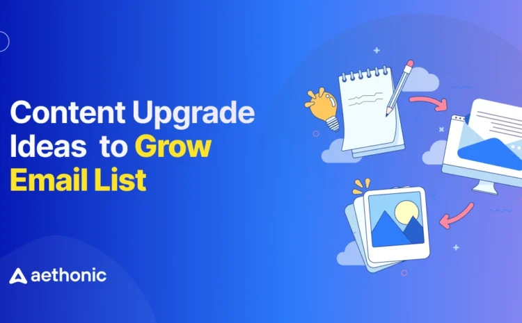
📚 Related reading: 30 Content Upgrade Ideas to Grow Your Email List 👉 Read more
30. Save wishlist with email
Many people browse casually — not to buy immediately.
A “save wishlist” popup keeps them in your circle without pressure.
For example:
“Like what you see? Save your wishlist and we’ll email it to you.”
This helps in two ways:
- The visitor gets a reason to leave their email.
- You can follow up later when you have discounts on those same items.
It’s not about forcing a sale — it’s about keeping interest alive.
31. Offer back-in-stock alerts
Sometimes a visitor leaves simply because the item they want isn’t available.
Instead of letting them go for good, use an exit popup that says:
“This item is sold out, but we’ll email you the moment it’s back!”
Add a small form asking only for an email — nothing else.
This is great for eCommerce stores. You not only keep their interest but also collect leads that convert automatically when the stock returns.
32. Personalize with the last viewed item
Imagine this — a visitor browses three items, scrolls a bit, and then decides to leave.
Right before they go, your popup appears showing the exact product they viewed last:
“Still thinking about the red leather bag? Here’s 10% off if you grab it now.”
It feels personal, relevant, and timely.
This approach works because you’re not showing a random offer — you’re reminding them of something they already liked.
33. Show a different offer to return visitors
Not every visitor should see the same thing twice.
If someone came earlier and ignored your first popup, don’t show it again.
Instead, change your message for returning visitors.
Example flow:
- First visit: “Get 10% off your first order.”
- Second visit: “Welcome back! Here’s free shipping — just for returning.”
This makes your brand feel aware and human. Repetition irritates, personalization connects.
34. Localize the offer by country
People from different countries respond to different motivators.
If your store or SaaS tool sells globally, use location-based exit popups.
For example:
- Visitors from the US see: “Free shipping across all states.”
- Visitors from Germany see: “Jetzt 15 % Rabatt — nur heute.”
- Visitors from Bangladesh see: “BD customers: Pay easily with bKash.”
It feels local and relatable, and that small comfort builds trust instantly.
35 .Reduce the form to one email field
Complicated forms kill conversions.
When you ask for name, phone, company, and website — people skip.
An exit popup should never feel like a survey. Keep it minimal:
“Get your 10% coupon. Just leave your email.”
That’s it. One field, one button.
When you reduce friction, completion rates go up — often double.
36. Exclude logged-in customers from discounts
One of the worst things you can do is show a discount popup to someone who just bought from you.
It feels unfair.
Set your popups to exclude logged-in or recently purchased users.
Instead, you can show:
“Thanks for being a customer! Check your dashboard for exclusive rewards.”
This builds loyalty and prevents frustration. Smart targeting is not just about converting new users — it’s about respecting your current ones.
User experience & timing popups for smooth interaction (Make every popup friendly)
37. Trigger only after time on page
Some popups show too early — before a visitor has even read anything. That leads to instant closes.
Instead, set your exit-intent popup to trigger only after a certain time, like 30 or 45 seconds.
Why it works:
- The visitor has already shown some interest.
- You’re not interrupting; you’re offering help when they’re done.
Combine this with scroll tracking, and your popup will appear at the perfect moment — just before exit, after they’ve engaged enough.
38. Use tap-friendly design on mobile
On mobile screens, everything feels tighter.
If your popup buttons are small or your text is hard to close, users will get annoyed.
Design tips:
- Use big buttons (minimum 45 px height).
- Keep only one clear CTA.
- Make the “close” icon easy to see.
- Avoid long forms.
Example:
“Join our newsletter — quick, one tap.”
[ ✅ Yes, Sign Me Up ]
Mobile visitors behave differently, and your popup should respect that.
39. Add a gentle “No thanks, keep browsing” link
No one likes feeling trapped by a popup.
If your message only offers one big “Yes” button and no clear way out, visitors will close the tab out of frustration. That’s not the experience you want to leave behind.
A simple “no thanks” link can fix that. It gives people a sense of choice and respect — and surprisingly, that freedom can increase conversions.
Try something soft and human, like:
“No thanks, I’ll check it out later.”
“Maybe next time.”
“I’ll skip the offer for now.”
Place it right under your main call-to-action — small, but easy to spot. The tone matters too; it should sound kind, not sarcastic or guilt-driven.
When users see that your brand gives them space to decide, they trust you more. And many of them will actually click back to your offer instead of leaving.
Sometimes giving people an easy way to say no is what makes them say yes later.
40. Test timing and design for best response
The final rule: no one gets it perfect the first time.
Run tests — small changes can make a big difference.
Here’s what to test:
- Timing: how long before the popup appears.
- Copy: “Wait!” vs. “Hold on!” can change clicks.
- Offer: discount, free shipping, or newsletter — which converts more.
- Design: colors, size, and position.
Use analytics to see what works, then refine.
Exit-intent popups aren’t “set and forget.” They’re tools that get smarter when you test and tweak.
Wrapping up: Get more conversions with exit popups
You’ve now realized how exit-intent popups can keep visitors from leaving your site. Each small change, like a reminder, a bonus offer, or even a quick question, can really help.
If you want to make effective popups for any reason, like sales, email signups, product launches, or getting back abandoned carts, then Poptics popup builder is the best choice.
The drag-and-drop builder makes it easy to design great-looking popups in minutes, and its built-in tracking shows what works. With smart triggers like exit-intent, scrolling, and time delay, you can show the right message at the right time.
Whether you are sharing an offer, collecting contacts, or keeping visitors from leaving, Poptics gives you everything you need to get more signups or sales, all without coding or confusion.
Try it once and see how exit popups can turn lost visitors into loyal customers.