What is a Discount Popup? How to Create Discount Popup in WordPress
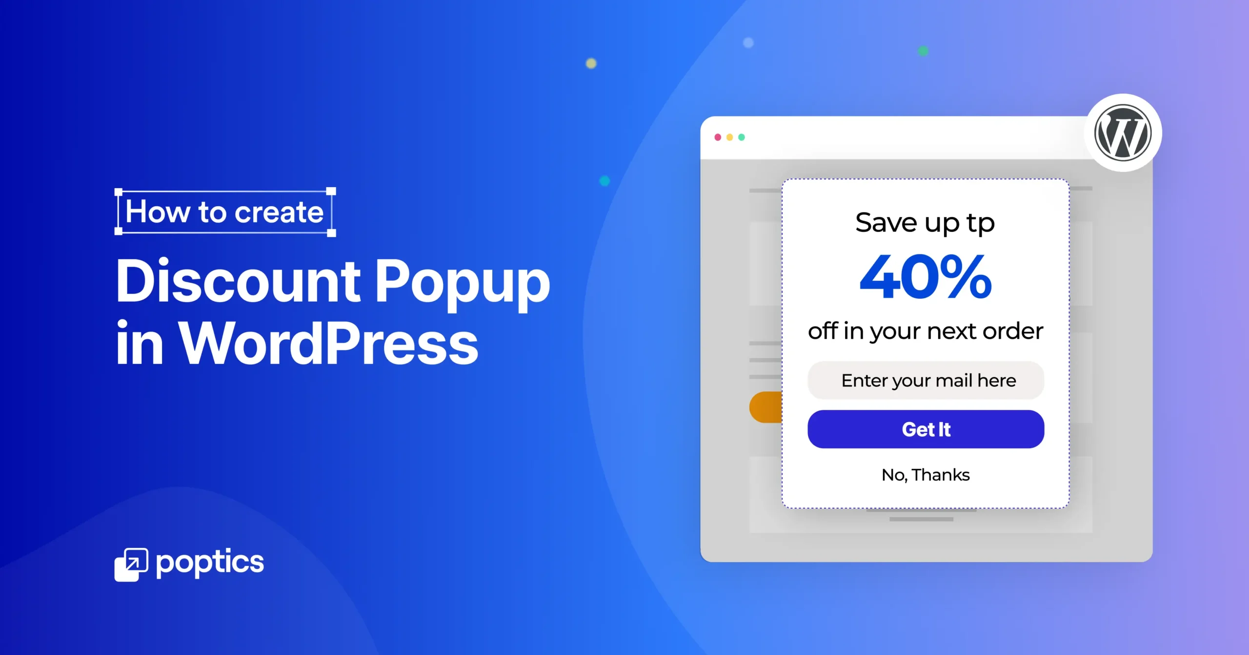
Did you know? Up to 70% of first-time visitors leave without making a purchase, but a well-timed discount popup can change that. It’s a simple way to grab attention and boost conversion rate.
In WordPress, a discount popup isn’t just about showing a coupon. It can also help reduce cart abandonment, grow your email list, and drive quick sales.
In this guide, we’ll show you how to set up a discount popup, share some real-life examples, and offer tips and common mistakes to avoid.
Let’s get started.
Table of Contents
What is a discount Popup?
A discount popup is a small message that appears on your website and offers a deal, such as a discount, free shipping, or a limited-time offer. It usually occurs (depending on the rules set up by the website owner) while a potential customer is browsing your website.
These popups have a clear goal: get people to act and turn visitors into customers. That action could be buying something, signing up for a newsletter, completing a purchase they started, or providing them with real value through education.
Here are a few common types of discount popups:
- Welcome offer popups: It appears to new visitors as soon as they land.
- Exit-intent popups: Appear when someone’s about to leave the site.
- Scroll or time-triggered popups: They appear after a user scrolls a portion of the website or remains on the site for a specified period.
- Cart abandonment popups: Appear when someone has items in their cart but hasn’t checked out.
- Click-triggered popups: These only appear after someone clicks a specific button or link.
Discount popups are often short, simple, and focused. They grab attention, give something valuable, and guide users to the next step.
How to create a discount popup in WordPress (step-by-step)
If you want to grab attention and boost sales, showing a discount popup is a smart move. And the easiest way to do it on WordPress? Use Poptics.
Poptics is a simple and powerful popup builder made for WordPress users. It helps you create popups that look great and convert, whether it’s for a flash sale, a welcome offer, or a special deal.
We recommend Poptics because it’s lightweight, beginner-friendly, and gives you complete control over how and when your popup shows up. Know more about Poptics.
Let’s learn how to create high-converting promotional popups for your special discount campaigns using Poptics popup builder for WordPress.
Step 1: Install and activate Poptics
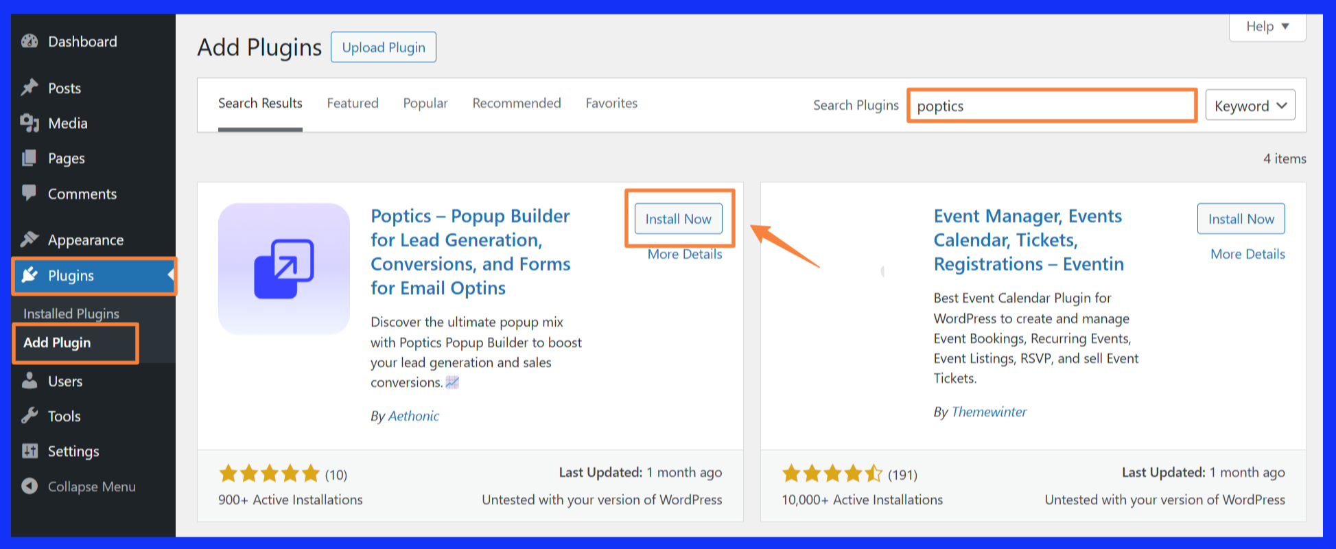
The first thing we need to do is to download and install the Poptics on your WordPress dashboard. Simply follow the steps below:
- From your WordPress dashboard, go to Plugins > Add New.
- In the search bar, type Poptics, then click Install Now.
- Once installed, click Activate.
That’s it! you’re ready to start building your first popup.
Step 2: Create a new popup
After installing and activating Poptics, you’ll see the onboarding screen. You can follow it or skip straight to the popup dashboard, where all the tools to create your popups are ready.
After activation, you’ll land on the popup dashboard. You can either follow the onboarding steps or create your campaign.
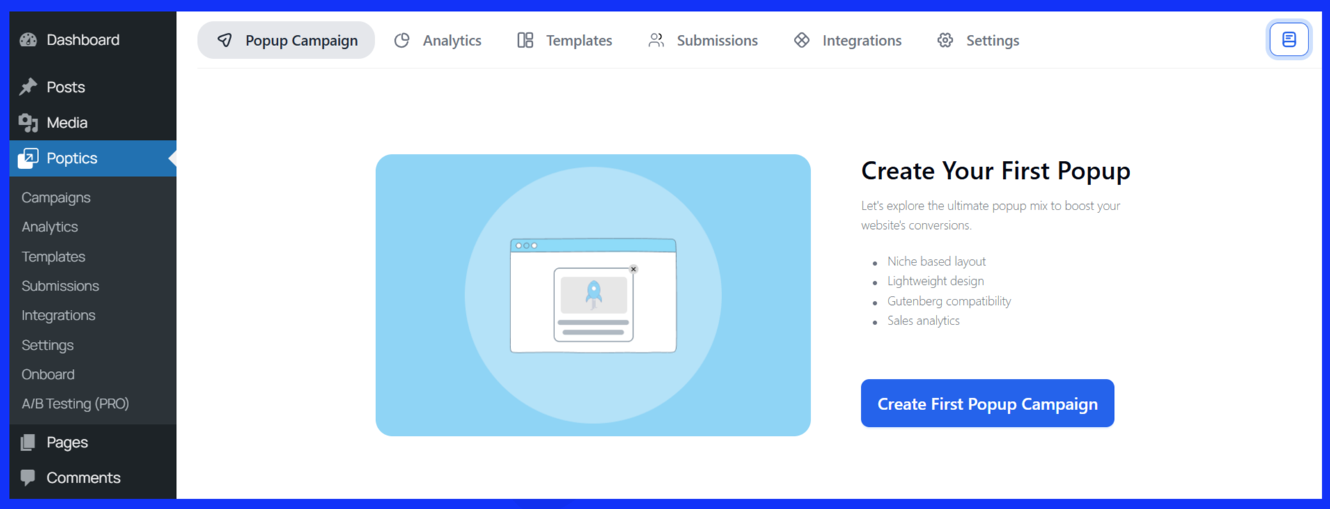
Click “Create Popups Campaign” to open the template selection screen. You can choose a ready-made template or design your own popup by selecting “Create from Scratch.”
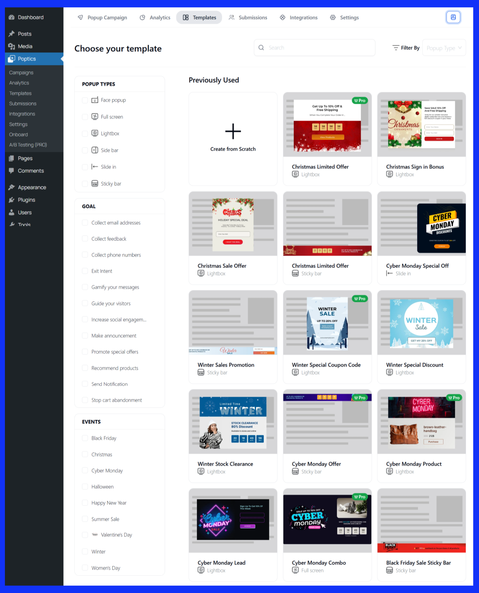
Let’s examine each process individually.
Create a campaign from scratch
- First, click on “Create from Scratch.”
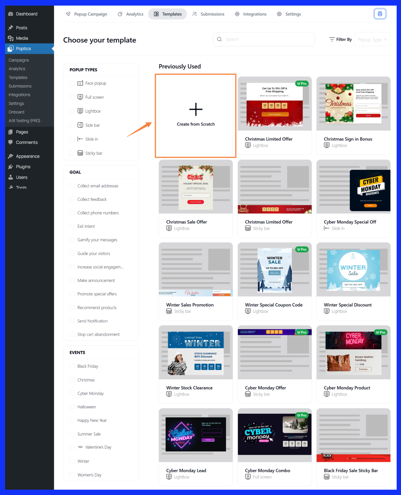
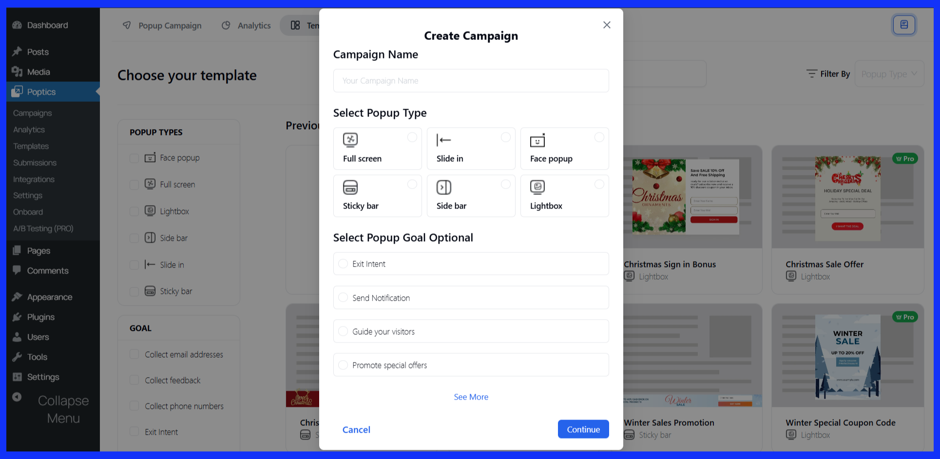
- Enter a Campaign Name and choose your Popup Goal.
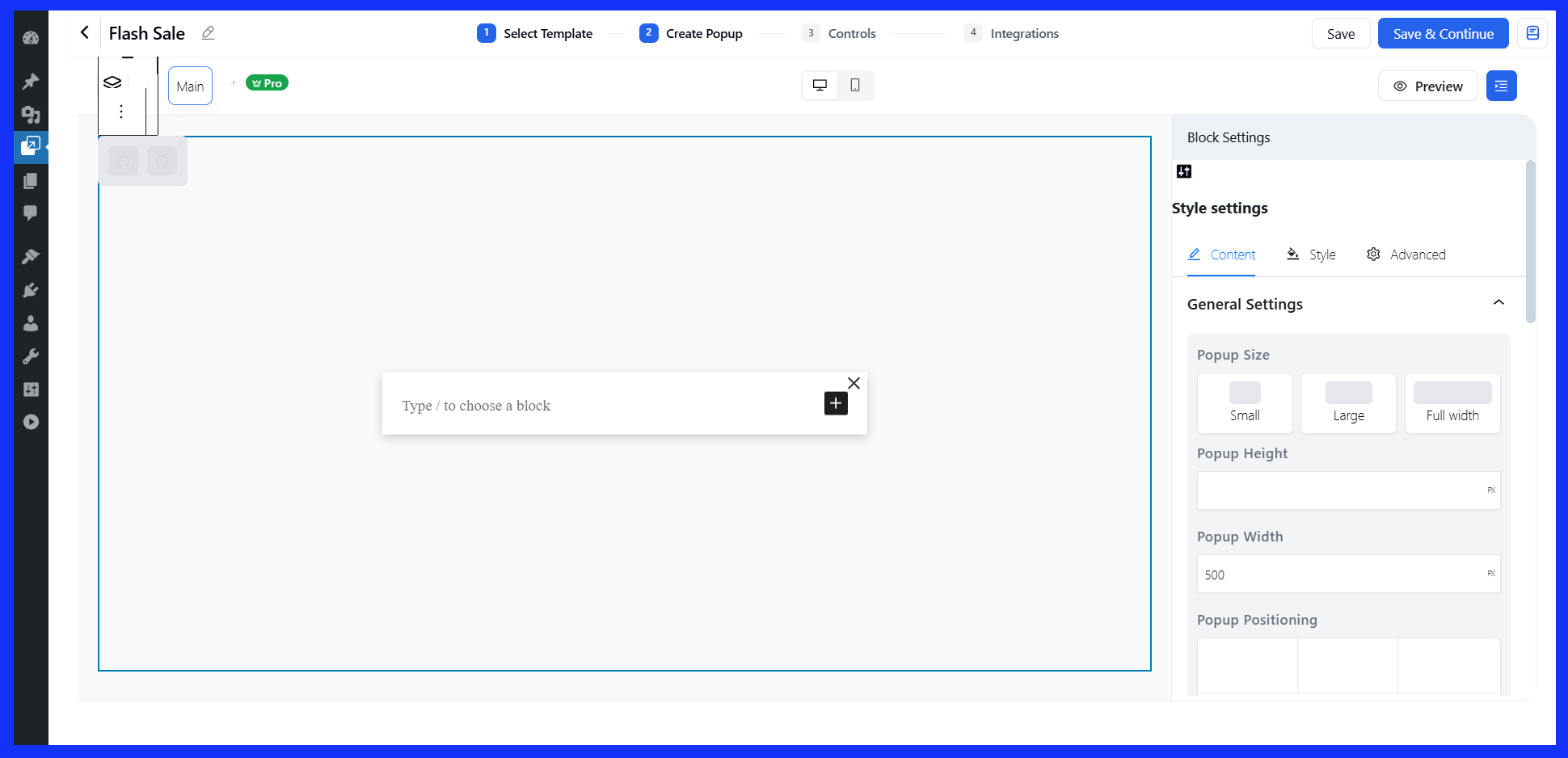
- This opens the popup builder where you can design the layout, add your offer text, and apply styles.
- When you’re ready, hit “Save & Continue.”
It will take you to the Control page. We will cover it in the customization section.
Choose a pre-made template
- Choose a popup type, your campaign goal, and event type.
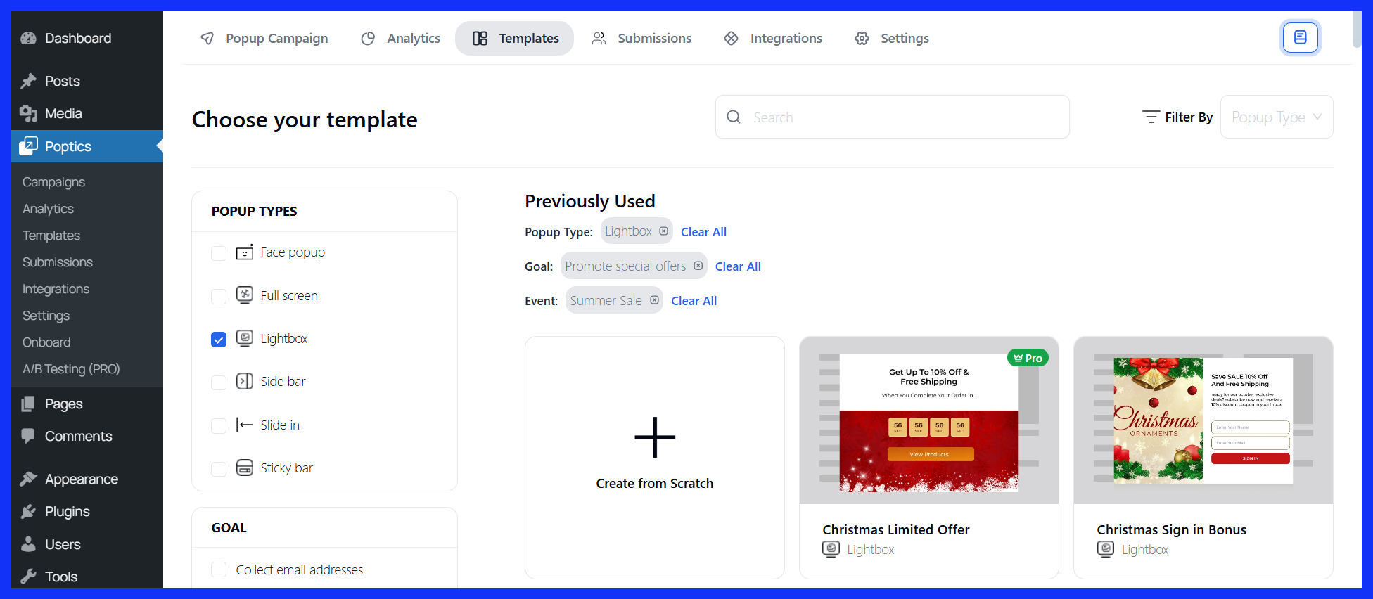
- Next, browse the template library and select one that suits your discount offer.
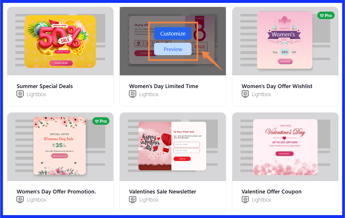
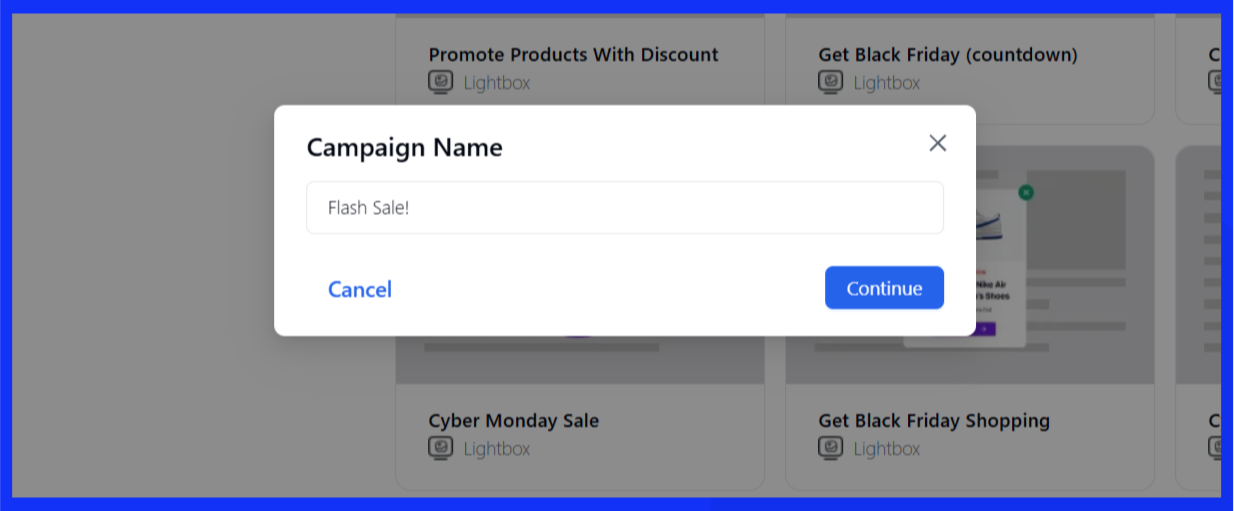
- Click Customize, enter your campaign name, and continue to the builder.
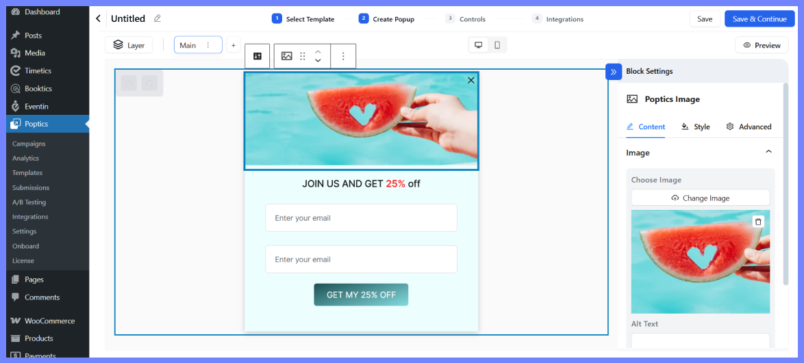
- Here, you can customize the design, adjust style settings, and update the campaign details. When you’re done, click “Save & Continue” in the top-right corner.
Create a campaign with AI (Pro)
If you’re using the Pro version, you can create popups with AI help. However, to utilize it, you must install Poptics with the AI add-on and the OpenAI integration.
Here’s how to Integrate OpenAI with Poptics.
So, here is the popup creation process,
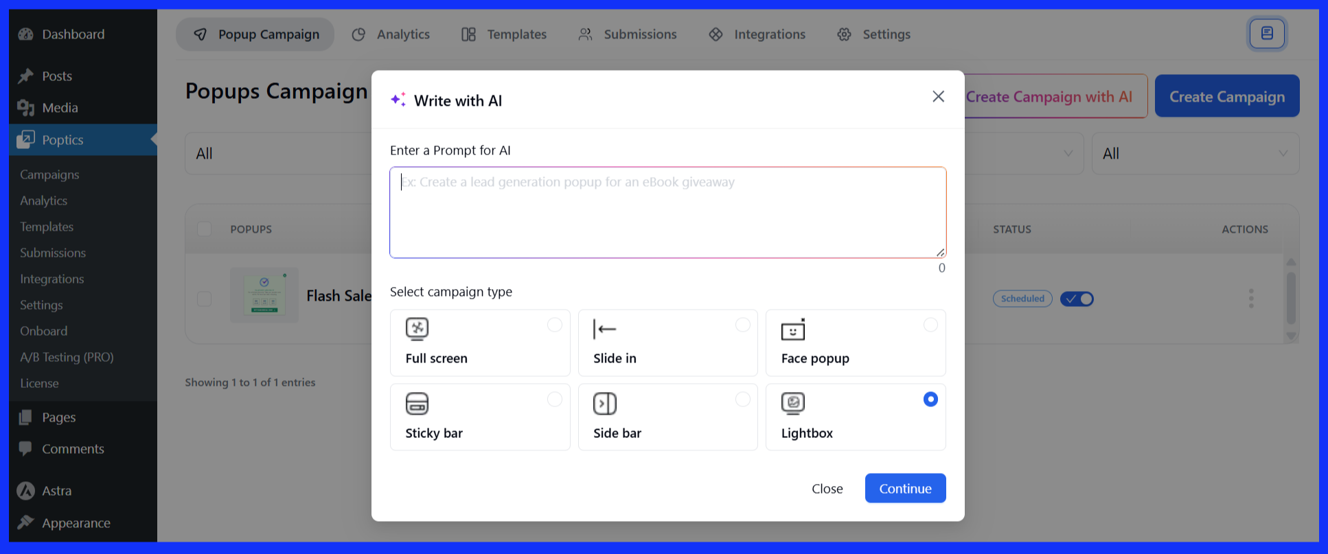
- Select “Create Campaign with AI” from the dashboard.

- Input a short prompt, choose your popup type, and let the AI handle the setup.. Then click on “Continue.”
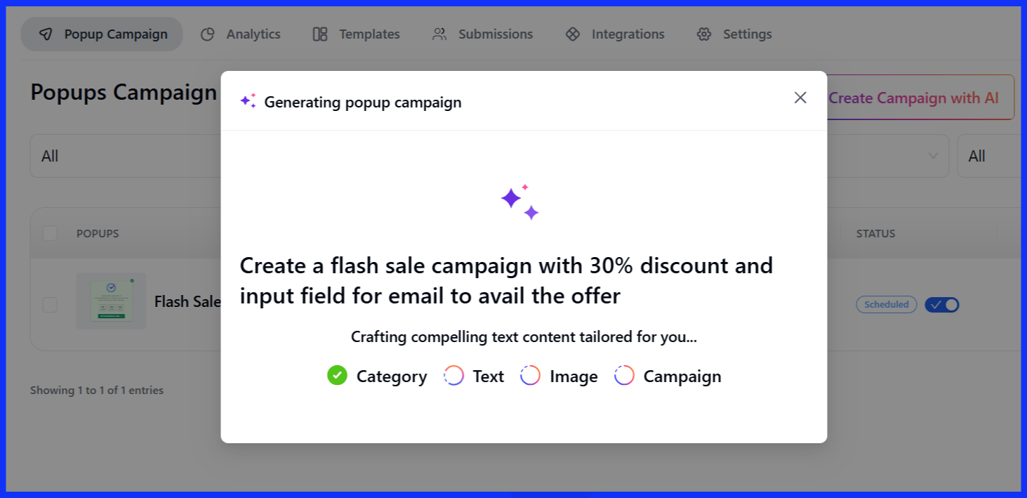
- It will now take some time for the popup creation to be completed according to your input.
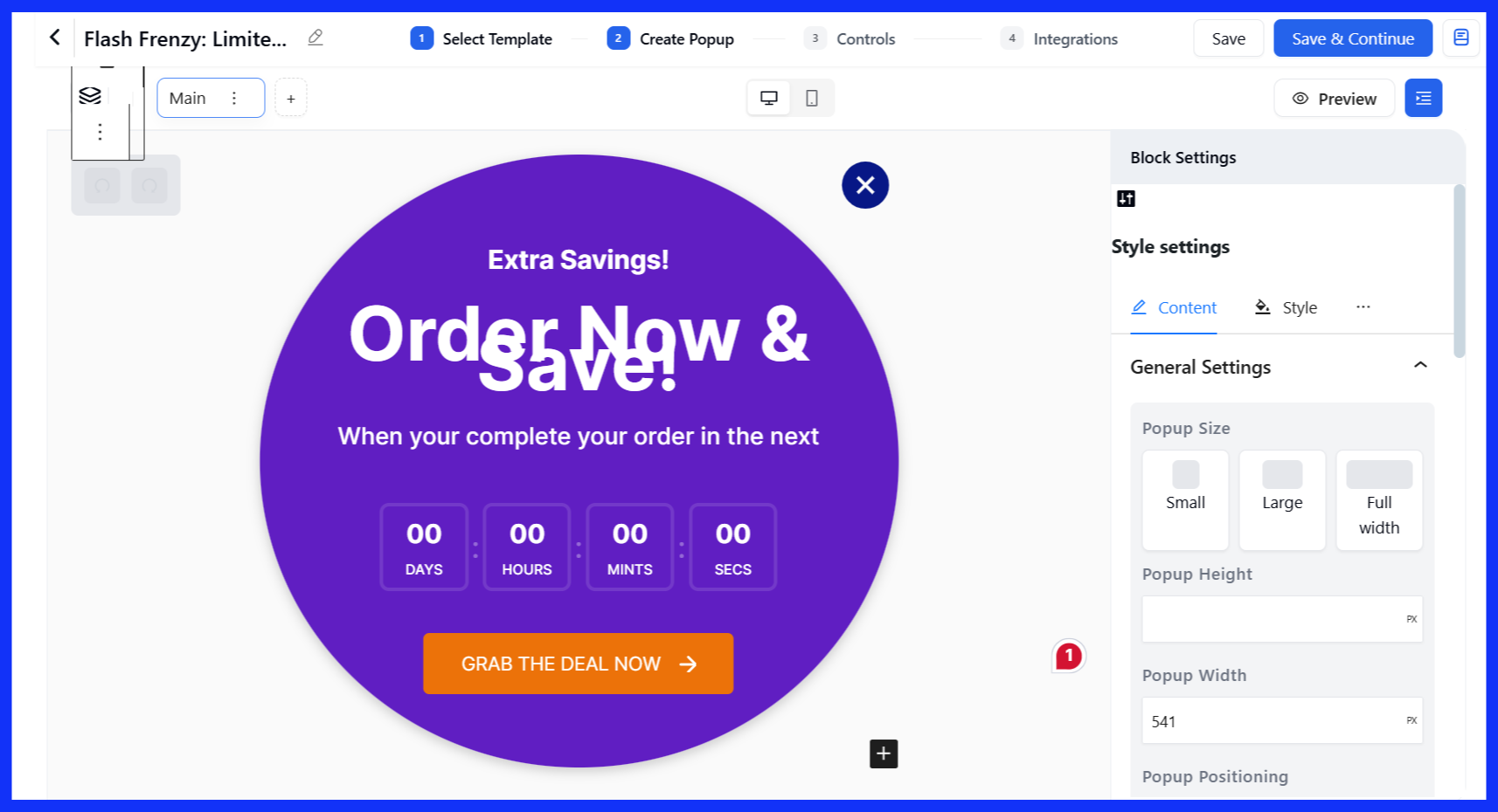
- Once generated, you can fine-tune the design like any other campaign.
Step 4: Customize the popup
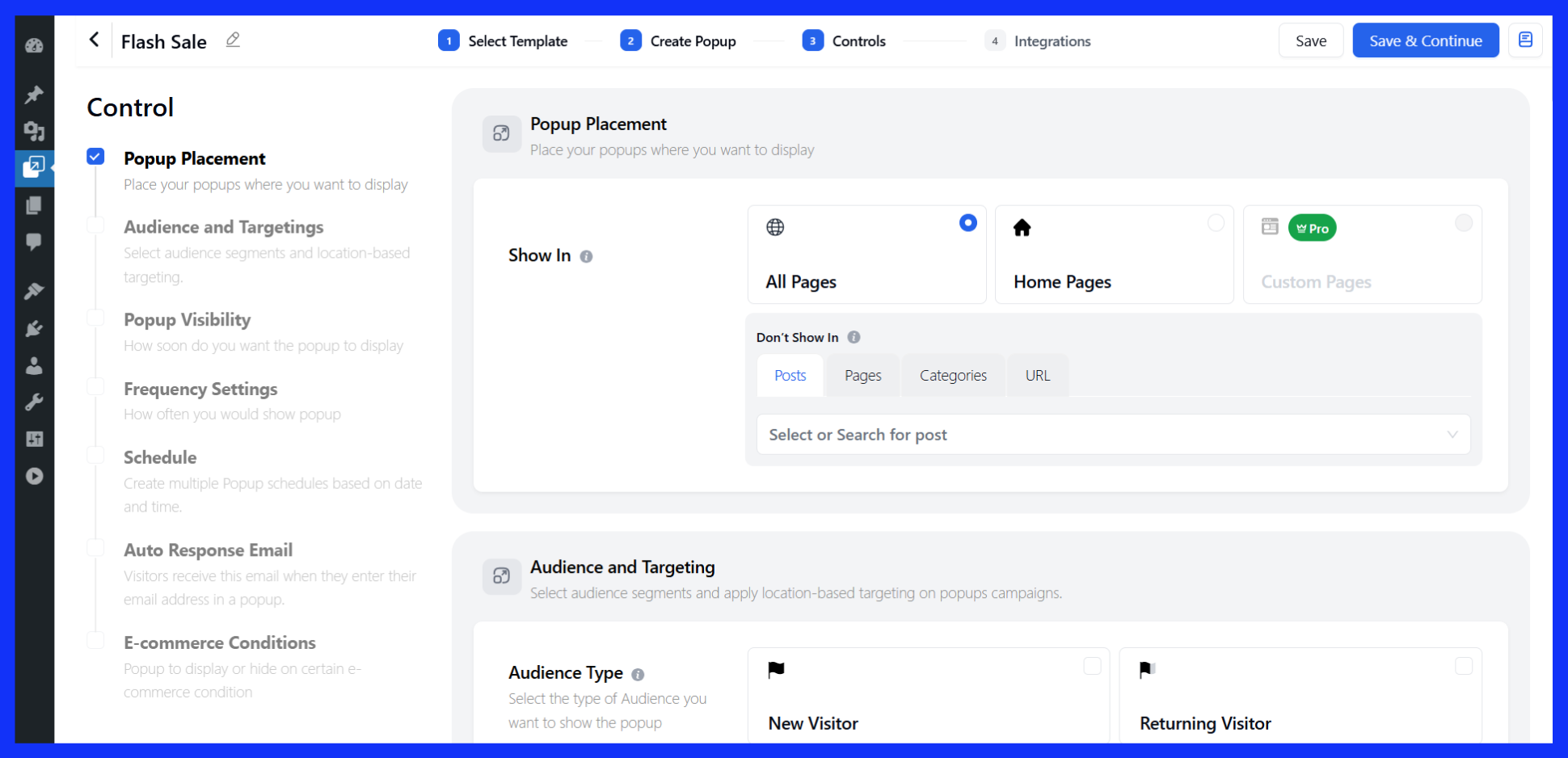
Now it’s time to decide how your popup behaves, where it appears, who sees it, and when.
Here are the main settings you can configure:
- Page placement – Choose specific pages or posts where the popup will appear.
- Audience targeting – Show the popup to certain visitor groups (location-based).
- Popup visibility – Set triggers such as page load, scroll, or exit intent.
- Frequency control – Limit how often it appears to avoid annoying repeat visitors.
- Scheduling – Choose start and end dates for time-sensitive offers.
- Email response – Automatically send a confirmation email when someone signs up.
- E-commerce rules (Pro) – Show popups based on cart behavior or checkout status.
Once done, click “Continue to Publish” or “Save & Continue” to move on.
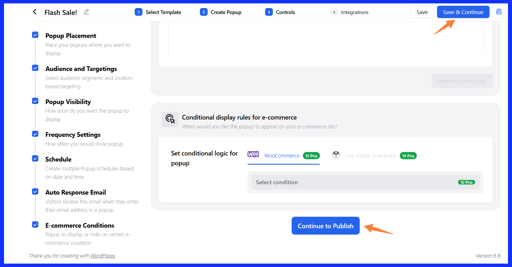
Note: There are numerous settings to explore. Feel free to explore them and try out what works best for you!
Step 5: Configure integration
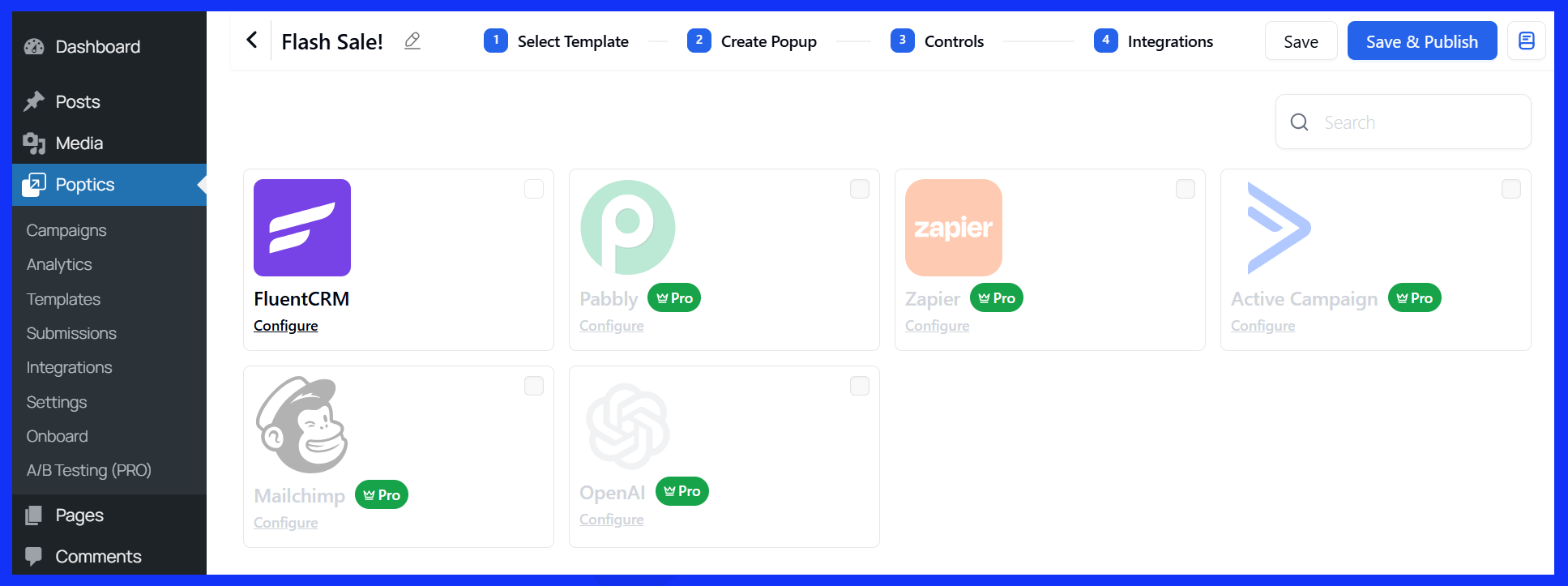
Poptics lets you connect your popup to other automation and lead management tools.
- Free Version: Connect with FluentCRM to handle follow-ups and email workflows.
- Pro Version: Unlock more options like Mailchimp, Zapier, Pabbly, ActiveCampaign, and OpenAI.
These integrations help you sync contacts, automate follow-ups, and further personalize your campaigns.
Preview and publish
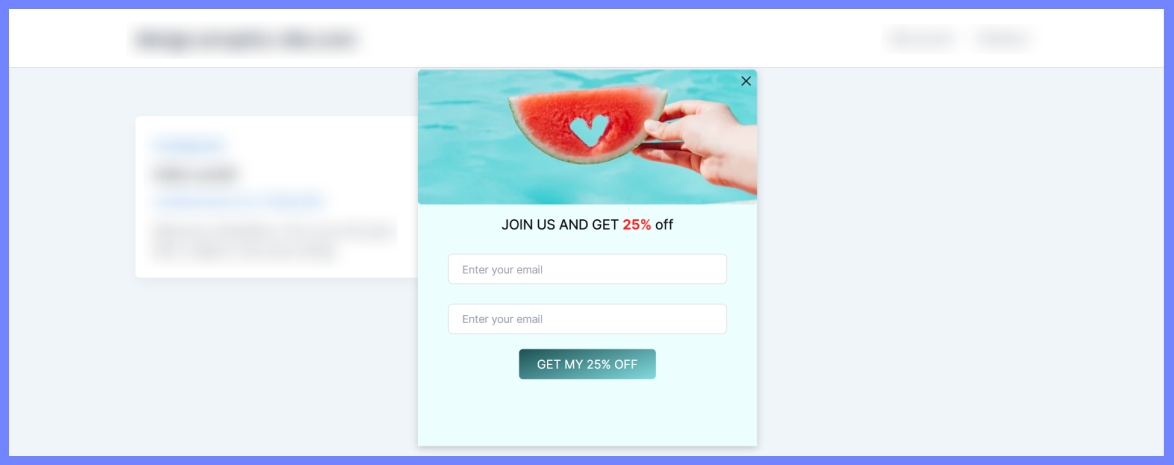
Once everything looks good, click “Save & Publish.” Your discount coupon popups is live and will start showing to your site visitors based on your settings.
Track and measure your popup performance
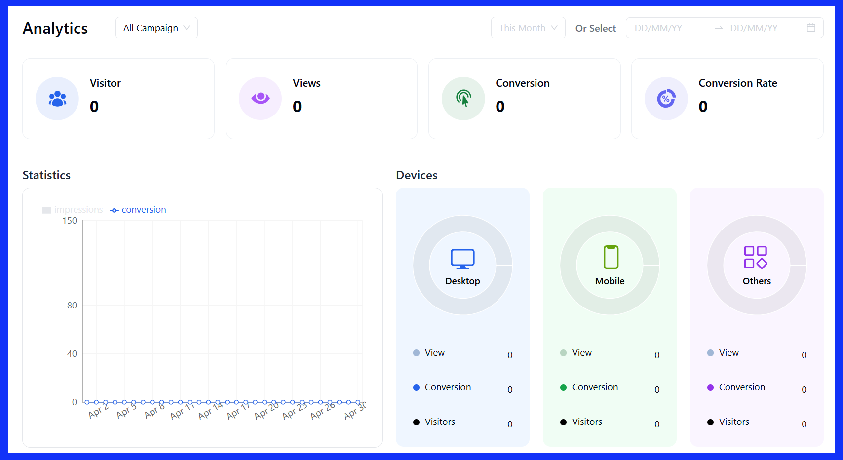
Poptics makes it easy to monitor how your popups are performing, so you can improve results quickly. The built-in Campaign Analytics provides all the essential insights in one place.
You can check:
- See how each popup is performing separately with detailed reports.
- Filter results by date and check performance for any time range.
- Utilize geo-targeting insights to identify which regions respond most effectively to your pop-ups.
- Visual charts help you see what’s working and what needs fixing.
- Track unique visitors and conversions to know how many people saw your popups and how many took action.
- Check device-based performance and compare the results across desktop, mobile, and tablet devices.
Use this data to refine your pop-ups over time and enhance performance.
Real-world discount popup examples & why they work
Now that we’ve gone through how to set up a discount popup, let’s look at a few discount popup examples of how they’re used in real websites and, more importantly, why they’re effective.
These aren’t flashy tricks or gimmicks. Each is built around a simple idea: showing the right message to the right person at the right time, and most importantly, built with Poptics.
Let’s walk through a few standard setups across eCommerce and content sites.
1. Welcome offer popups
Let’s say someone lands on your site for the first time. After a few seconds, they see a small popup offering a welcome deal. These show up almost immediately when someone visits your site for the first time. This is also known as email subscription discount popups.
A typical message might say:
“New here? Get 10% off your first order—just enter your email below.”
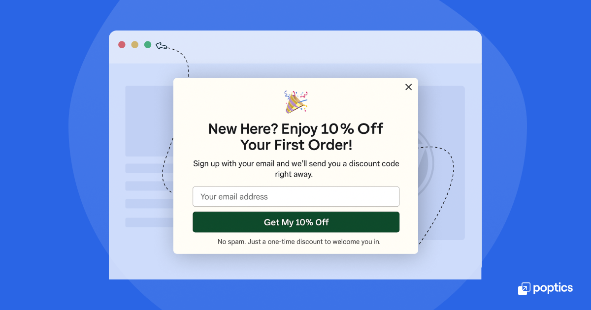
Why it works:
It gives first-time visitors a small reason to stick around and explore. It’s also a low-pressure way to grow your email subscribers list. You’re offering something valuable (discount coupons) without asking for much in return.
2. Exit-intent popups
Imagine someone browsing your product page. They scroll for a bit, maybe check a few items, but they don’t add anything to their cart. Then, just as they’re about to leave the page, a popup appears with a message like:
“Leaving so soon? Here’s 10% off your first order.”
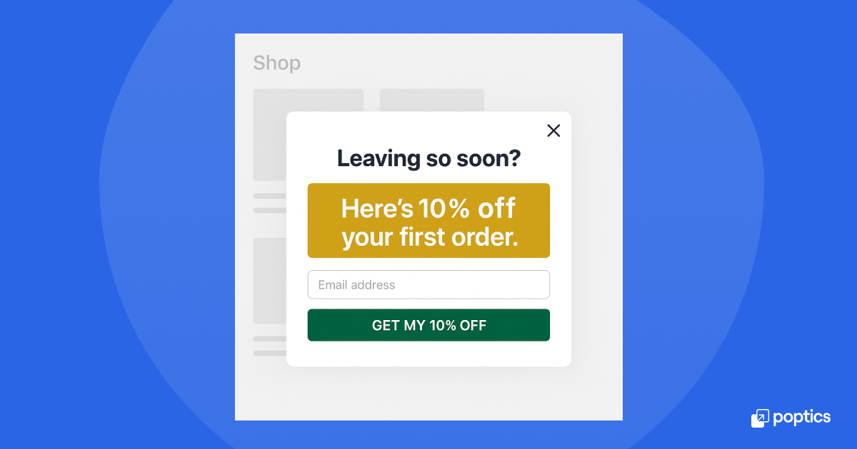
This kind of popup is called an exit-intent popup. It’s triggered when someone’s mouse moves toward the browser toolbar, usually a sign that the user about to close the tab or hit the back button.
Why it works:
It shows up at the right moment when someone is just about to leave, so it doesn’t interrupt browsing. And because it’s tied to the user’s exit behavior, it often gets attention. Even if they don’t buy immediately, they might sign up with their email to get the discount code, which helps you stay in touch.
3. Scroll or time-triggered popups
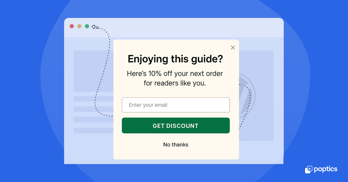
If you’re running a blog or content-heavy site, you might use a popup that appears halfway through a post or after a visitor scrolls 60-70% down the page. It might look like:
“Enjoying this guide? Here’s 10% off your next order for readers like you.”
Why it works:
If someone’s spent time reading or browsing, they’re probably more interested than someone who just landed on the page. These popups target people who are already engaged, which makes them more likely to respond.
4. Cart abandonment popups
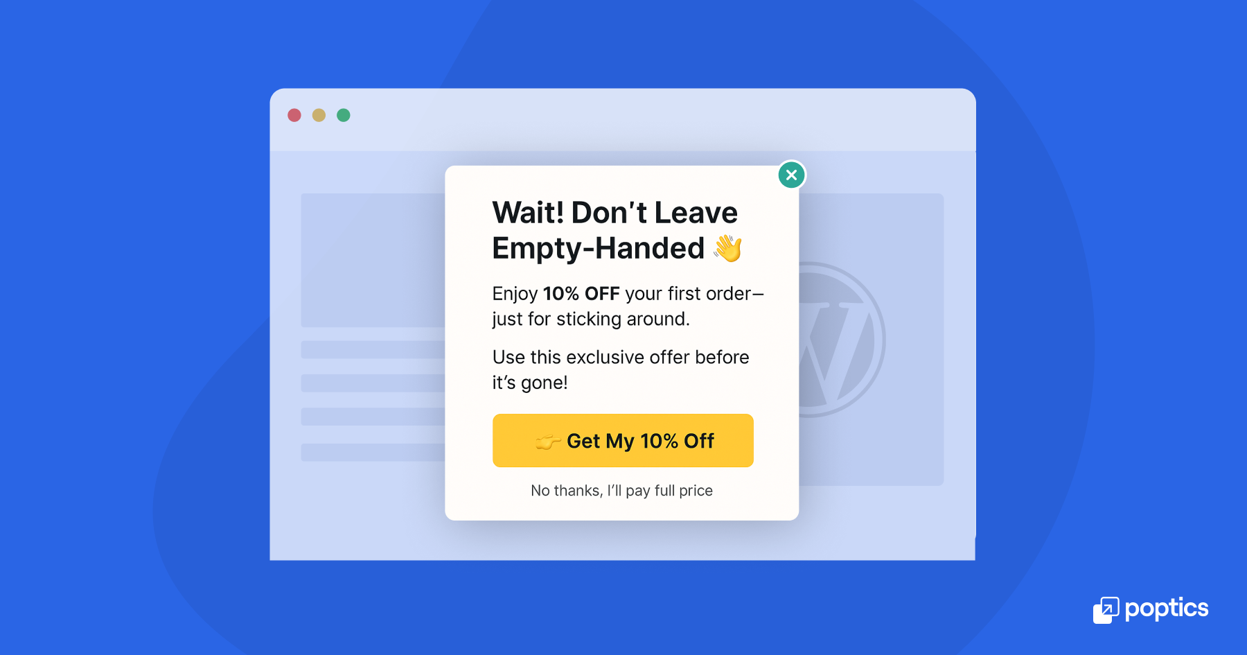
These are shown when visitors have added items to their cart but haven’t checked out. The popup might say:
“Still thinking it over? Use code SAVE10 to get 10% off your cart.”
Why it works:
It speaks directly to people who are close to making a purchase but haven’t completed it. Sometimes, they only need a reminder or a coupon code to purchase.
5. Click-triggered popups
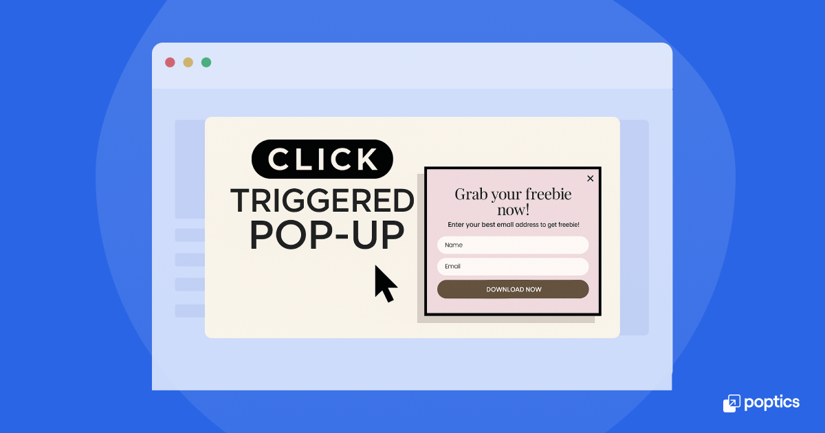
Unlike the others, click-triggered popups only appear after someone clicks a button or link. For example, clicking “Get 10% Off” on a banner might trigger a popup that collects an email address in exchange for the discount.
Why it works:
Click-triggered popups are less intrusive because the visitor chooses to see them. It’s a more interactive, user-driven way to offer percentage discounts.
6. Free shipping reminder popup
Another typical example shows up during shopping or after a product is added to the cart. It might say something like:
“You’re $10 away from free shipping—add one more item to unlock it.”
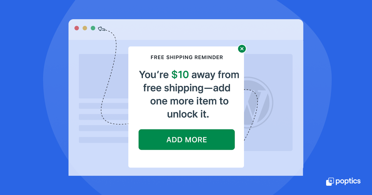
This one usually appears on product or cart pages and is tied to cart value.
Why it works:
It helps increase the average order value by giving shoppers a small goal. Instead of offering a flat discount, it encourages them to add just a little more to their cart to receive a benefit. Many shoppers respond well to this kind of nudge, especially if they are already considering another item.
7. Gamified popup (spin-to-win)
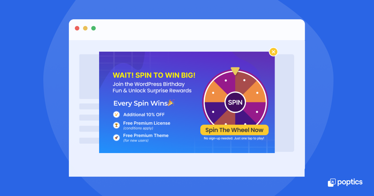
Some sites use an interactive gamified popup where users can “spin a wheel” or click to unlock a random reward. It could include offers like:
- 5% off
- Free shipping
- $10 off orders over $50
These popups are more playful and often come with an email sign-up prompt.
Why it works:
The interactive element makes the offer feel more like a mini-game than a sales pitch. It adds a little fun to the experience and increases the chance someone will engage. Even if the reward isn’t huge, “winning” something feels satisfying.
8. Scratch card discount popup
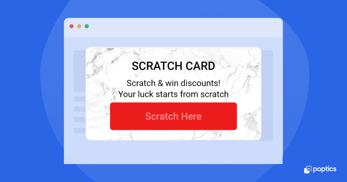
The scratch card discount popup lets visitors “scratch” a card to reveal a hidden discount, similar to a scratch-off lottery ticket. It might appear a few seconds after someone lands on your site or clicks a button like “Reveal My Offer.”
The message might say something like:
“Try your luck—scratch to reveal your exclusive deal!”
Why it works:
The interactive nature of the scratch card adds a sense of curiosity. Visitors are likelier to engage just to see what’s behind the card. Even if the discount is modest, the experience feels more fun and personal than a standard offer. It benefits seasonal sales, product launches, or campaigns targeting first-time visitors.
9 best practices for high-converting discount popups
Making a popup is easy. Making one that works well is where a little planning helps.
Here are a few things to remember when creating a discount popup. These tips are based on how real users behave and what motivates them to respond.
1. Make the Offer clear and simple
People don’t want to guess what your popup is about. If you’re offering 10% off, say it plainly. Keep your headline concise and your message clear and focused. Also, avoid cluttering the popup with too much text or buttons. A simple layout helps visitors decide quickly whether the offer is for them.
Example:
Instead of this, “Sign up for our exclusive VIP program to receive seasonal discounts and updates.” Use this: “Get 10% off your first order. Enter your email.”
2. Use timing that fits visitor behavior
Not every visitor is the same. Some are simply browsing, while others are ready to make a purchase. So, don’t show a popup when someone lands on the page. Give them a few seconds to look around first.
Time-triggered or scroll-based popups are more effective because they only appear when someone is engaged.
What works better:
– Show after 5–10 seconds
– Trigger after scrolling 30–60% down the page
– Use exit intent for people who are about to leave
3. Choose the right trigger
Different visitors behave differently, so your popup should reflect that. An exit-intent popup works well for someone who’s about to leave. A cart abandonment popup helps when someone is lingering with items in their cart. If you’re promoting a sale, a scheduled popup that only runs during those dates makes sense.
Triggers should match intent, not just fire at random.
4. Match the design to your site
Your popup doesn’t need to look flashy, but should match your site’s colors, fonts, and style. This helps it feel like a part of your site, rather than something that interrupts it. A consistent look also builds trust, especially if you ask for an email address or offer a coupon code.
5. Keep the close button easy to find
Visitors should always have the option to close the popup easily. Whether they’re on a desktop or mobile device, ensure the “X” or close link is visible and functions properly. This small detail goes a long way toward creating a smooth user experience.
Good examples:
- “Claim My Discount”
- “Get 10% Off”
- “Show Me the Code”
Avoid vague text like “Submit” or “Click Here.” Be direct about what the button does.
6. Use frequency limits to avoid overload
It’s tempting to show the same popup repeatedly, but most people don’t want to see it more than once. Poptics and other popup tools let you set frequency controls so the same popup doesn’t appear too often, especially for returning visitors.
Try settings like:
- Show once per session.
- Don’t show again for 3 days after it’s closed.
- Only show on specific pages.
7. Keep it mobile-friendly
Popups that look fine on a desktop can be hard to read or use on a phone. Make sure your popup is mobile-friendly: the text should be large enough to read, the buttons should be easy to tap, and the layout should adjust to smaller screens.
Most popup tools offer a mobile preview mode—use it to ensure everything works as expected.
8. Test one thing at a time
If you’re unsure what popup works best, start with one idea and test it. You can try different headlines, trigger times, or offers to see what works best. But test one thing at a time, otherwise it’s hard to tell what’s making the difference.
9. Add a countdown timer (Optional)
Sometimes, a timer helps people act sooner, especially during a sale. But don’t fake it. If there’s a deadline, show it. If not, skip the timer. Use timers carefully. They work best when tied to real events like:
- “Sale ends in 2 hours.”
- “Offer valid today only.”
- Just be honest about the timing.
📢 Good read: 25+ Proven Lead Generation Headlines and Form Creation Guide
Common mistakes & how to avoid them
Even with a good popup tool, making choices that hurt your results is easy. Below are a few common mistakes people make when creating discount popups on WordPress, along with some ways to avoid them.
- Showing popups too soon: One of the most frequent issues is displaying a popup as soon as someone lands on a page. Visitors haven’t had time to look around or understand what your site offers, and being greeted by a popup right away can feel pushy.
How to avoid it: Give people a chance to browse first. Use time-delayed or scroll-based popups so the message appears after they’ve engaged with your content. - Using the same popup for everyone: It can feel irrelevant if you show the same message to every visitor, no matter where they’re from or what they’re doing. Someone returning probably doesn’t need the same “new visitor” discount again.
How to avoid it: Segment your audience. Most popup tools let you show different messages based on visitor behavior, device, or location. Use this to make your popups more valuable and timely. - Overusing discounts: Offering a discount is helpful, but if every visitor sees one immediately, it can reduce the perceived value of your products. People may start to expect a discount every time they visit, and avoid buying at full price.
How to avoid it: Use discount strategy carefully. Offer them to new visitors, people about to leave, or during limited-time events. This keeps the offer meaningful and prevents visitors from being trained to wait for a deal. - Poor mobile experience: Some popups that look fine on desktops don’t work well on phones. The text might be too small, the buttons complex to tap, or the popup may block the entire screen with no way to close it.
How to avoid it: Always preview your popups on mobile before publishing. Select designs that scale well, and ensure the close button is easily accessible on smaller screens. - Not testing or updating your popups: Once a popup is live, it’s easy to forget. However, over time, offers may become outdated, links may break, or the design may no longer align with the rest of your site.
How to avoid it: Check your popups regularly. Update the copy if needed, and test different formats occasionally. Some tools even offer built-in testing features to compare versions and identify which works best. - Interrupting checkout or important pages: Placing a popup on the checkout page or during form submissions can be distracting or confusing. If someone is ready to pay or sign up, stopping them mid-flow isn’t helpful.
How to avoid it: Avoid using popups on sensitive pages, such as checkout, payment, or account forms, unless they are directly related to the action (like an upsell or cart reminder). Otherwise, people can complete the process without interruption.
📢 Good read: How to Add Multi-step Popup Forms in WordPress
Conclusion
Adding a discount popup isn’t just about more clicks; it’s about offering the right message at the right time. Whether a welcome offer, limited-time discount, cart reminder, or flash sale, a well-placed popup can support your goals without getting in the way.
With tools like Poptics, you can set up popups in your WordPress site without coding. Simply select the design, timing, and triggers that best suit your site, and then connect them to your email list or WooCommerce store, as needed.
Keep it simple. Focus on clear messages and clean design. Test one idea at a time and see what your visitors respond to. That’s it.
Have questions about setting up your discount popup? Let us know in the comments or explore more WordPress guides on Aethonic.

